Each week I reverse engineer the products of leading tech companies. Get one annotated teardown every Friday.
Growth Dives: Claude, ChatGPT & Perplexity time to value
Time to Magic moment: Claude, ChatGPT & PerplexityHow to activate AI products like an expert
Join in the conversation on LinkedIn Some of the fastest growing companies right now are generative AI tools (genAI). Their growth is eye-watering:
What’s impressive is that this is a relatively new category of products. These tools have only been used by the general public in the last couple of years. With new categories, there’s often the wish to ‘educate the customer’ on how to use the product. But creating new behaviours in customers is hard. Super hard. Hence why these products have to do so incredibly well in onboarding users to drive new actions (like prompting and knowing what tasks to get help with). Why genAI tools need to work harder than mostThis is such an interesting case study because these products are so complex in how they’re made. They’re highly technical behind the scenes. Whats brilliant is how they hide this complexity in the UI. They don’t try to explain how it works or shove complexity onto the user (unlike a lot of products). Before doing this analysis, I had the wrong assumption that the UI wouldn’t be good. That they’d be stuffy and over-technical, or mention AI too much. How wrong I was. We’ll look at how my three favrouite genAI tools — Claude, Perplexity & ChatGPT — communicate value to their users, reduce friction and get new users to the core action ASAP. We’ll review:
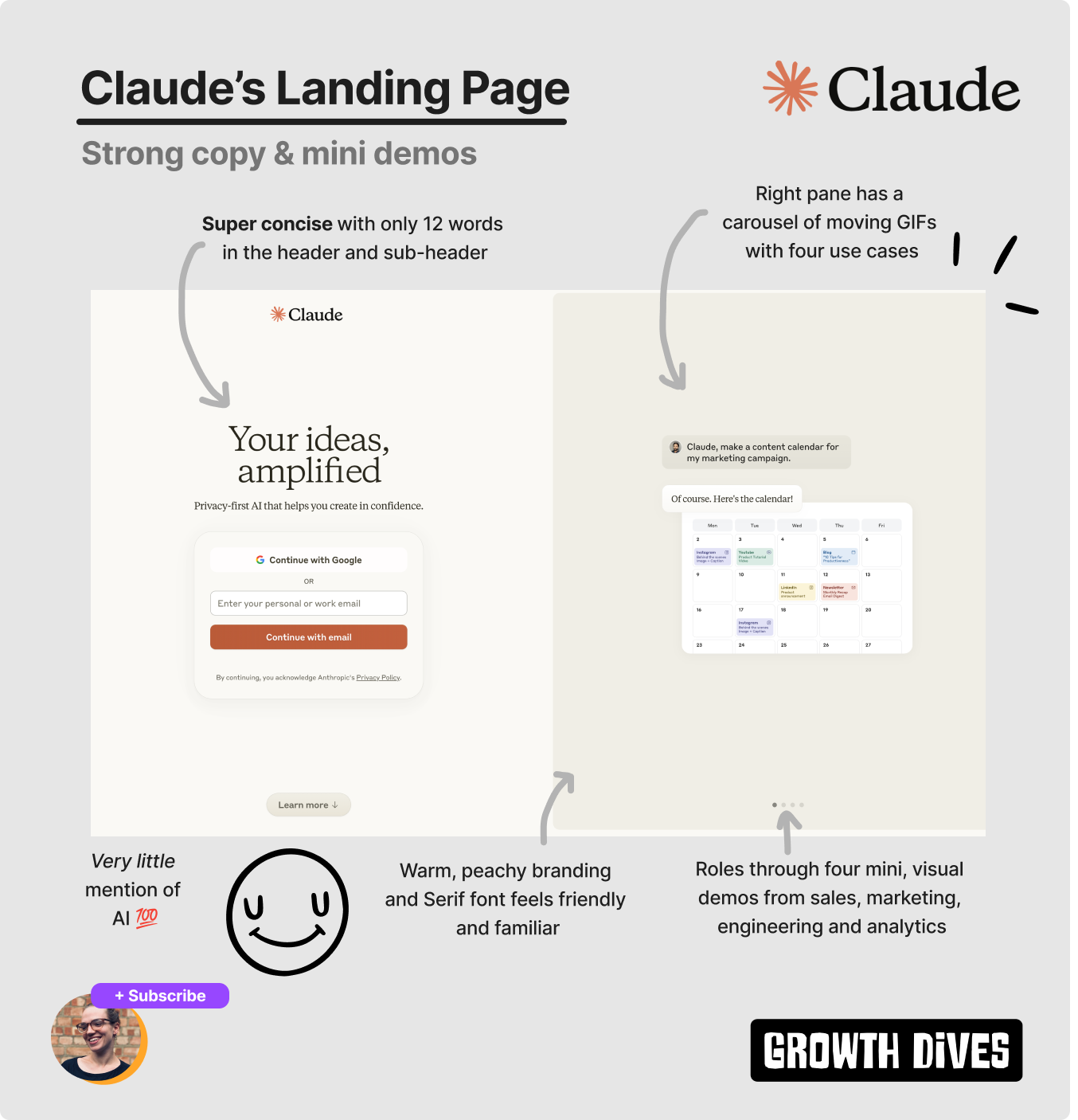
First up, Claude. ClaudeWhat is Claude? It’s the friendly one.Claude is perhaps a lesser-known tool versus ChatGPT, but one of its big competitors. They’re both AI chatbots but they vary for a few key reasons; Claude is better at word-based tasks, has a better free tier and sounds more like having a natural conversation, whereas ChatGPT is better at analysing, writing code and has a stronger paid tier. There’s debate on which is better but, in a nutshell, that’s my conclusion from using both. Opening Claude’s landing page for the first time, I love the branding and messaging. It feels soft and gentle.
We have warm oranges and beige colours with a Serif font, making the branding feel familiar, cosy and friendly. Very different to ChatGPT’s stark white-and-black simplicity.
The headline stands out in it’s large font size compared to the rest of the UI, drawing the eye first. The copy itself focuses on the desired outcome of being better at what you do: Your ideas, amplified The sub header then focuses on secondary messaging around privacy: Privacy-first AI that helps you create in confidence Impressively concise with only 12 words in the header and sub header combined. On the right, we see a carousel of animated prompting examples:
These are more like mini videos (someone types, enters and then the reply comes from Claude) mimicking the experience in the chatbot itself.
This was cool for three reasons:
As a result, Claude creates an early ah-ha moment 🧠 where new users realise the value of your product. Like a mini epiphany. Claude's iterations over the last 9 monthsInterestingly, the team have iterated on this landing page since April 2024, where the headline used to cycle between five value propositions: Spark your creativity, Shape your plans, Brainstorm ideas, Analyse complex data, Skip busywork.
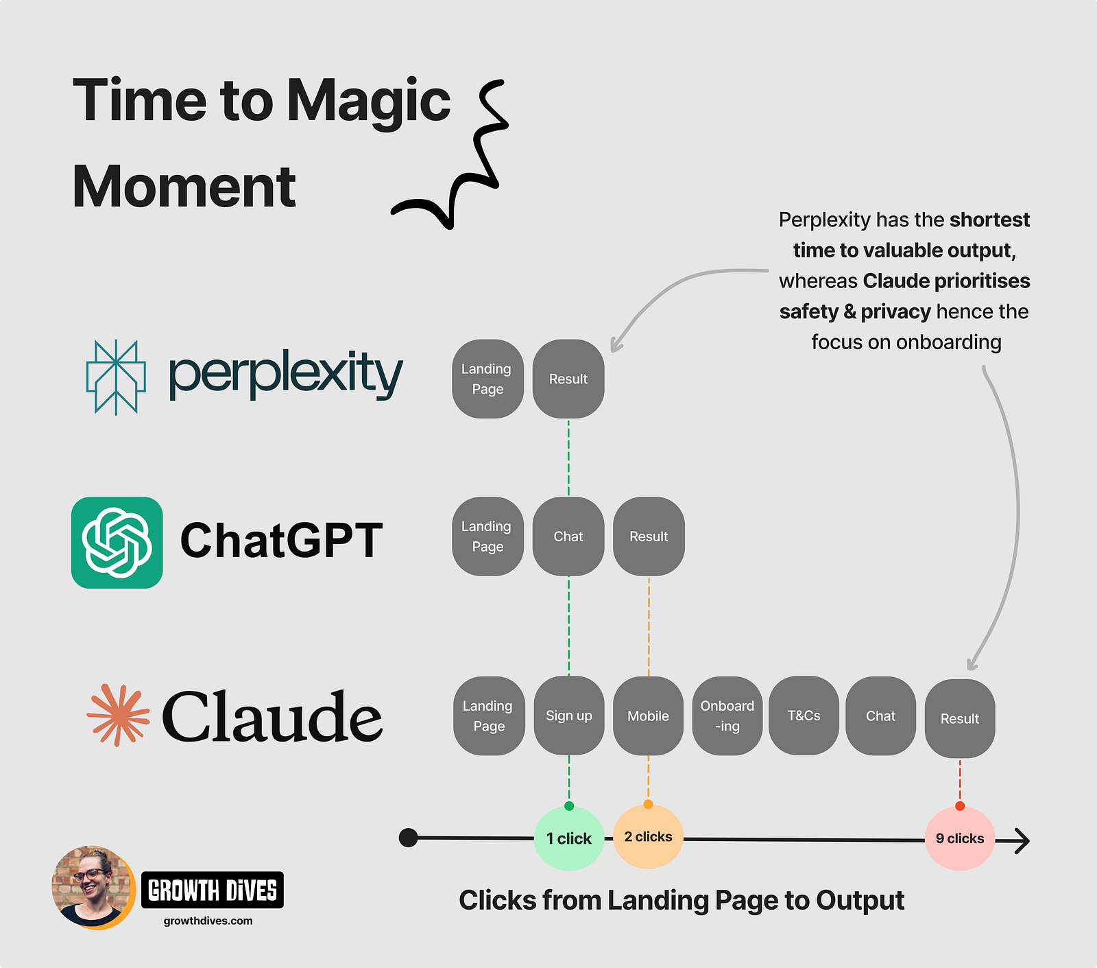
Seems like they’ve landed on one heading and a more visual landing page in the current iteration. I prefer the one now personally — and I’m assuming it won in testing. Onboarding sequenceMoving on, I create an account, after which I have to:
Then I’m in. The homepage itself is quite busy. Still friendly, with a personalised ‘good evening’ up top.
The default copy asks a direct question, and I’m given some prompt examples. Below, I see a description of Claude, as well as an iteration of the safety and privacy of the tool. Which is a wildly different experience to ChatGPT. ChatGPTThis is going to be a short section…Heading to the URL chatgpt.com I get straight to the core action. Chat.
It’s a simpler interface than Claude’s homepage, with…What can I help with? above the search bar (which kinda feels like I’ve just walked into a shop).
Below the search bar, I see five little pills that say: Surprise me, Summarise text, Make a plan, Help me write, More.
All with little icons to help with legibility, as the UI is so incredibly small on the page (too small, some would argue). The stark white background colour burns my eyes while I scrunch them to read the tiny copy. I can also see a tiiiiny T&C note at the base of the page stating that if I use it I’m agreeing to the terms (okay..).
Moreover, there’s a detail that I only noticed when refreshing the landing page in an incognito tab: the pills change. The next time I open the landing page, I see: Code, Summarise text, Brainstorm, Surprise me, Help me write, More. On the third time, I see: Help me write, Brainstorm, Get advice, Summarize text, Code, More. Each pill is a genius use of ChatGPTs Jobs to Be Done, showing the user what tasks are possible. All bar the ‘surprise me’ pill, which is an example of a Curiosity Gap 🧠 — when missing or intriguing information in an experience motivates the user to take action. So, I follow my curiosity, tap ‘surprise me’ and see what looks more like Google search’s UI, with Make a plan pre-typed into the search bar.
Underneath, I’m shown example searches for make a plan to; get a promotion, to buy a new car, of meals for the week, for a weekend in New York. I’m hungry, so I tap ‘meals for the week’.
After which, I get a response asking for more info, which I can’t be bothered with at the time. It makes sense — in order for ChatGPT to create me a good plan, it needs more context. It needs to chat. But I kinda just wanted an example, right there to riff off. Just like Perplexity does. PerplexityWhat is Perplexity? Something a bit different.As another big competitor to ChatGPT, Perplexity is more of a research tool. Where ChatGPT is more for creating content, Perplexity is more for retrieving information and researching topics. You can also switch to other models through Perplexity, including Claude and ChatGPT4o (which makes it feel like a much better deal than paying for all three separately).
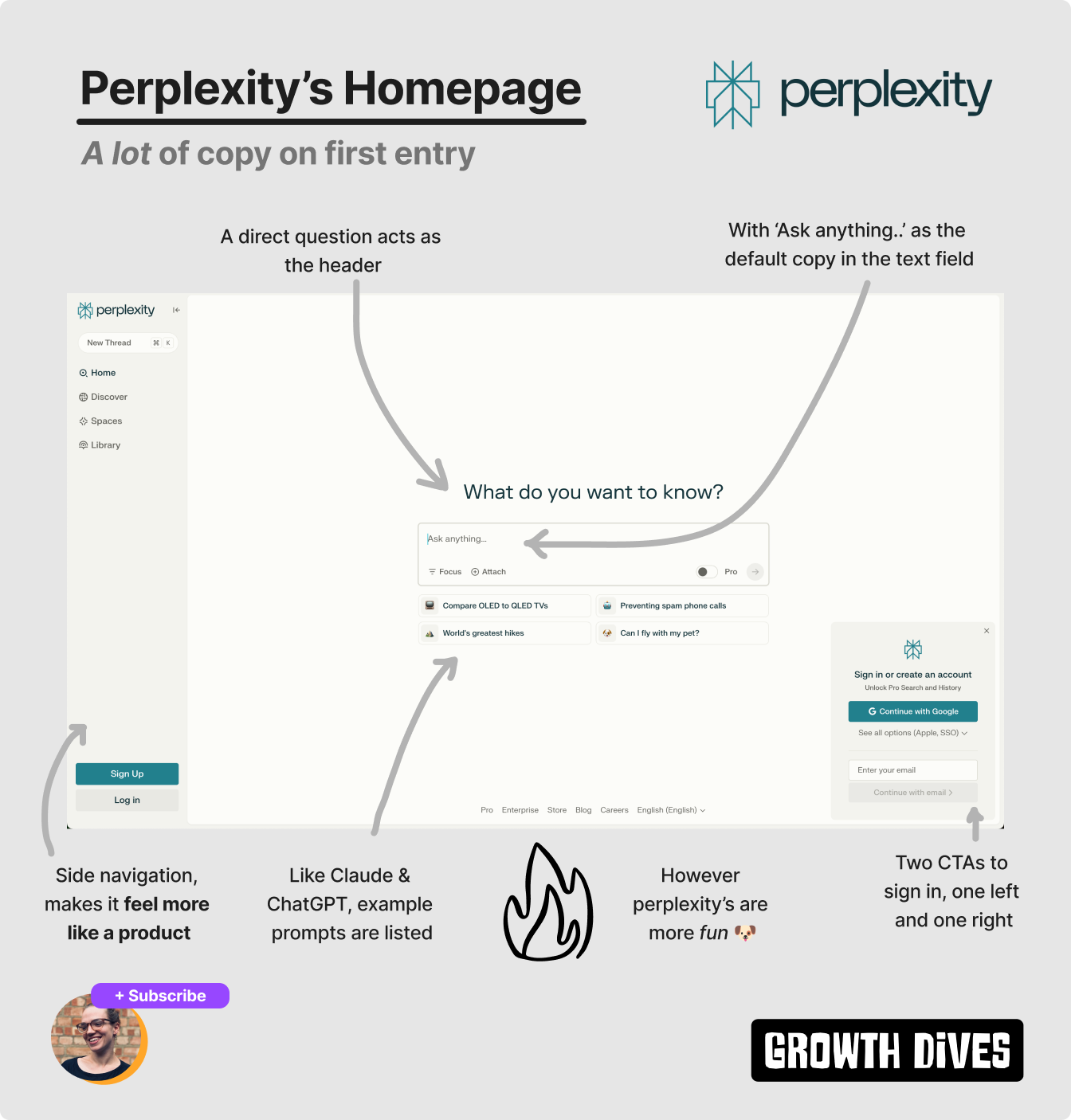
Anyways, away from commercial and partnerships, onto UX. Time to magic momentLike ChatGPT, Perplexity doesn’t beat around the bush. Straight to core action from the URL perplexity.ai.
I see the question: What do you want to know? in a much easier-to-read font size versus ChatGPT. The background is also an off-white, which feels less stark and more relaxed than ChatGPT.
We see a similar search UI recipe to Claude and ChatGPT, with Perplexity sporting:
The prompts also change when you refresh the window (if a bit slow, for me I couldn’t get more than two before it bugged out).
What’s different is that Perplexity’s prompts are more specific and more fun. I see:
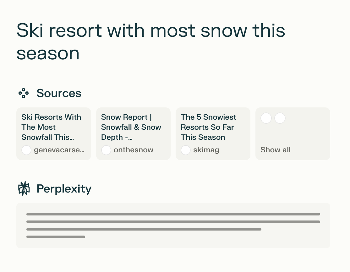
It’s like they’ve crawled the internet for on-trend topics spanning hobbies, health and admin. Questions that might be on your mind. Very smart. Another key difference with Perplexity is that there’s a side navigation panel. For me, this makes it feel more like a product. More full, more legit. More like something I’d pay for versus ‘just’ a chat. Perplexity’s superior search UIA big difference with Perplexity is that you can see the logic steps it’s taking when it searches. With Claude and ChatGPT, you get a pulsing icon that looks like something is ‘thinking’, however Perplexity shows you the steps its taking in more detail. First, I see the sources its looking through. The UI moving in a way that feels like its reading things.
Then the text starts to type out.
In their pro search, it looks even better with the word ‘researching’ taking you through each question its asking.
For me, this builds trust. I know the steps taken and I can see what its using to create the outputs. I can see it ‘thinking’. This is called the Labour Illusion Effect 🧠, which is where “People value things more when they see the work behind them” — Growth.Design. The output itself is also way more detailed after one simple click compared to Claude and ChatGPT, which often ask a follow up question (because they’re chat bots).
Often, I don’t want to chat. I want an answer. For me, this is the strongest activation experience of them all. I get to a magic moment with each tool, however I’m most trusting, impressed and confident in Perplexity. In summary: Perplexity is my fave 🫶As a full package — time to value, UI, branding, useful outputs, fun experience — my vote goes to Perplexity. However the bar here is high. Competition in genAI is intense with new products and models coming out continuously. Looking over all three examples, here are five things they all do really well:
Of course that’s not all when choosing what genAI tool to use. But from a UX perspective, Perplexity was the most delightful.
To compare the pros and cons of all three:
What’s your favourite? Would love to know. Fin. Let me know what you thought of today's newsletter. Reply and let me know (I read everything). What next? There's a few options:
See you next week! 🪩 Rosie |


Growth Dives
Each week I reverse engineer the products of leading tech companies. Get one annotated teardown every Friday.