Each week I reverse engineer the products of leading tech companies. Get one annotated teardown every Friday.
Growth Dives: 3 excellent B2B SaaS paywalls from Slack, Notion & Canva
3 excellent B2B SaaS paywalls from Slack, Notion & CanvaPsychology, personalisation and anti-pricing Want to listen or watch? Here's a 3-min Loom summary of this week's episode. Enjoy!
There’s so much out there on pricing page psychology. So many blogs, videos, posts, case studies… So much that it’s overwhelming. And you can tell. There’s a lot of pricing pages out there that are overwhelming in themselves - as if the PM's mind has exploded with all the possibilities, tactics and stakeholders. But not the three I’m about to show you. Oh no, these are excellent. We’re going to look at Slack, Notion and Canva’s pricing pages from January 2025 to see how both new and old tactics are at play to increase conversion to paid. As we’ll see, there’s no silver bullet to a high-converting pricing page, however there are three key rules:
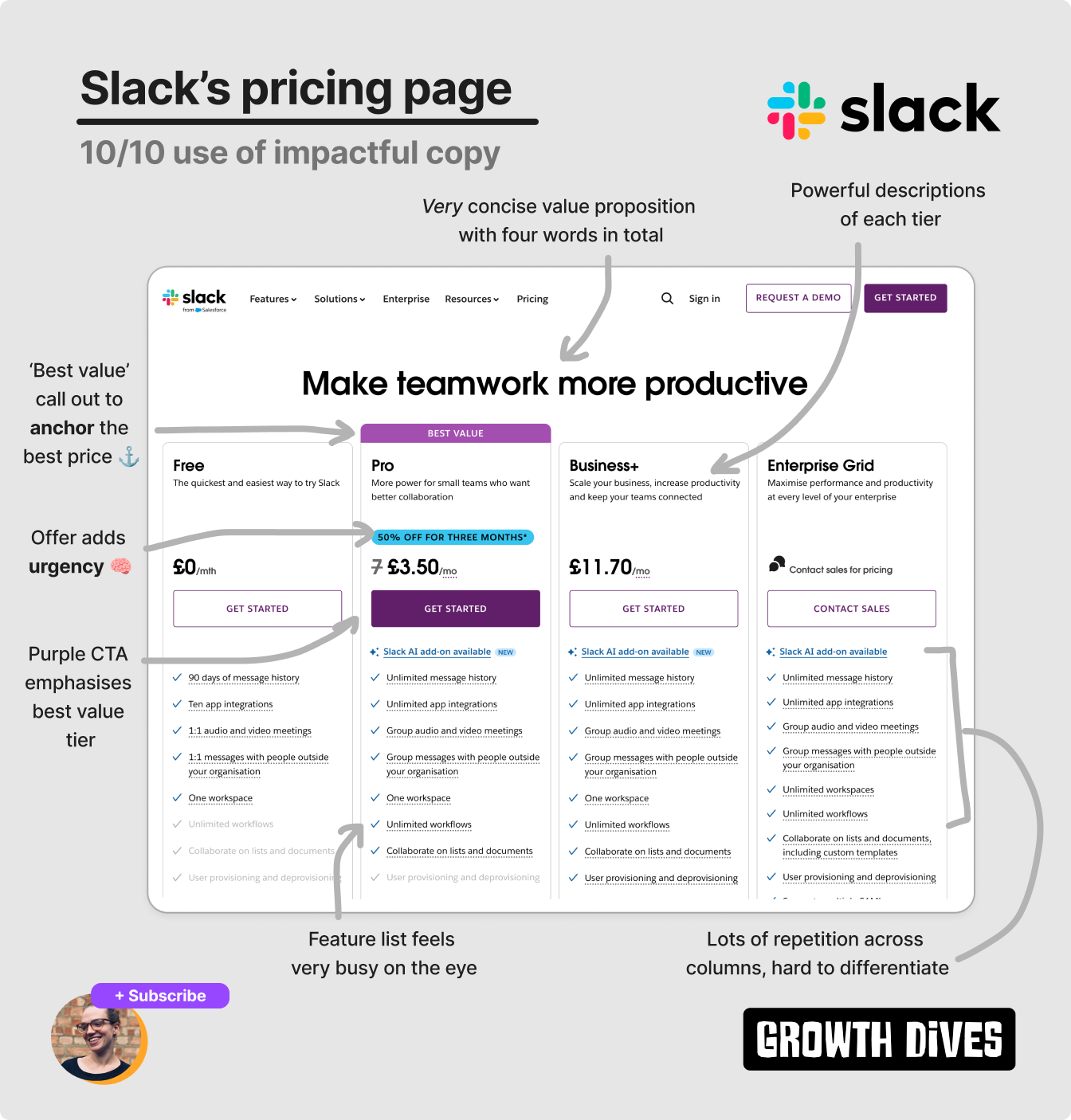
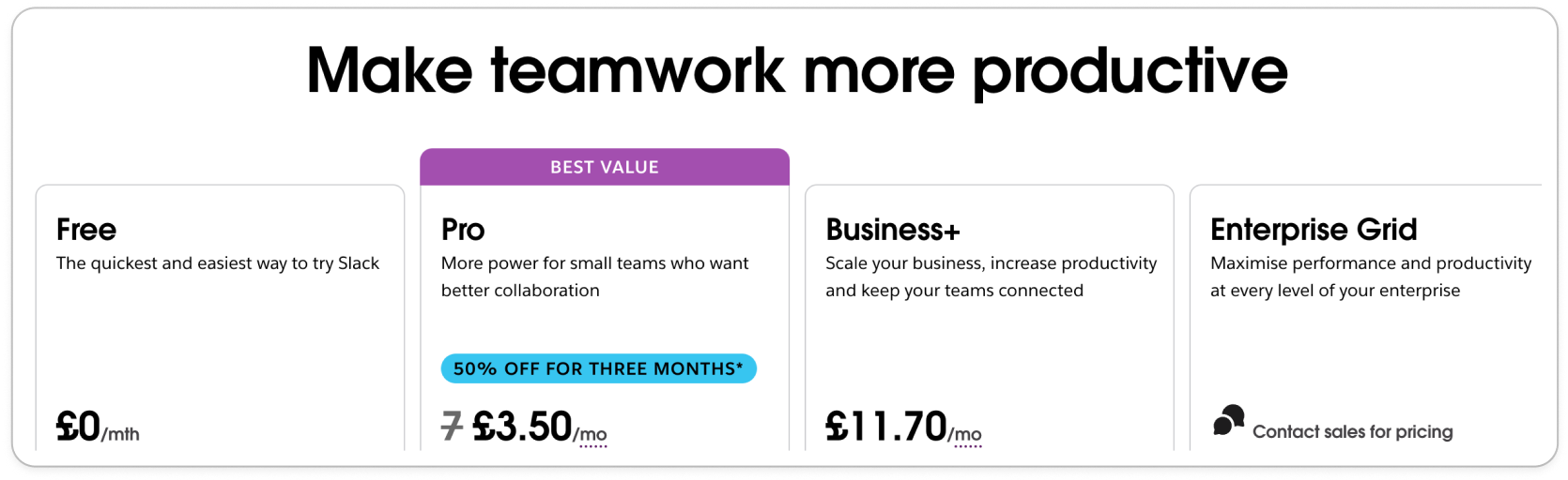
Across the three examples, we’ll see these three rules in play, as well as some cool newer ways to help nudge users to the right pricing options: personalisation, customisation and some anti-charm pricing. I’m excited to get into this one because when I first took these screenshots, I noticed some interesting things (as usual). But then when I actually annotated them I saw so much more. Off we go, first stop: Slack 🚎 Slack: Best for copy ✍️Out of the three examples, Slack feels the most ‘old school’. Old school in the white colouring and long feature list, with a relatively simple design overall.
There’s some basics done well here:
Notice how Charm Pricing is used. This is where prices that start with a lower number feel cheaper: £4.99 is seen as closer to £4 than £5. Slack uses £3.50 instead and £11.70 instead of £4 and £12. A tactic that goes back to the 19th century. Looking a bit closer, there’s a few more tactics Slack uses.
The ‘best value’ tier not only has a purple highlight above the column but the CTA matches drawing the eye and acting as a visual anchor 🧠. This reduces Paradox of Choice which, for some, can lead to measurable changes in conversion. Take GitHub who saw a 20+% increase in free and paid signups from a similar series of experiments. Additionally, on Slack’s pricing page you’ll notice there’s a 50% offer on the best value tier. This adds a sense of urgency and scarcity; we don’t know how long the offer is on, so feel compelled to grab it now. The UI also anchors the new price as cheaper by showing the original price crossed out next to a discounted price. The last (phew) pricing tactic is Framing of the price itself. Notice how the prices are listed per month instead of per year, meaning that the listed price is the smallest possible, making it feel cheaper.
You’ll also see some companies framing the price as £X/day, or comparing the price to something mundane like coffee (I’ve tried this on a pricing page, didn’t work…). Price framing is a super common tactic used on most pricing pages, but one that gets turned on its head when we look at our third example later on (Canva always pushing the boundaries it seems). My favourite thing though, is the copy. The headline is incredibly concise (so hard to do), as are the tier descriptions:
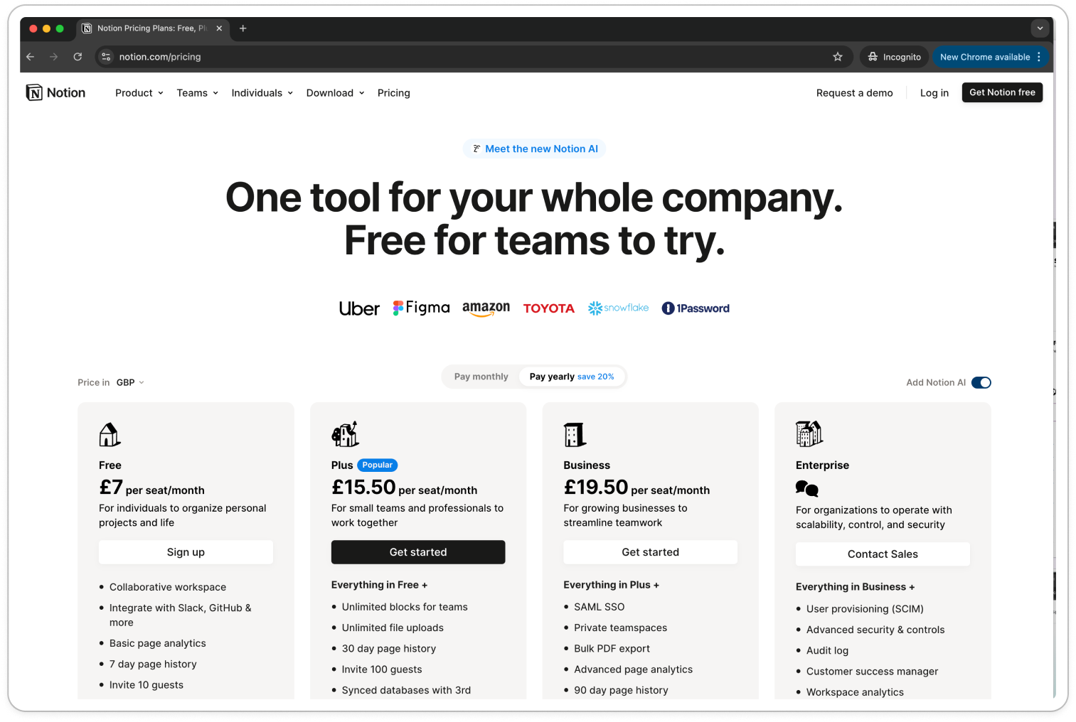
It’s clear that Slack knows the customer pains and gains for each customer segment. With this level of UX writing, the choice we need to make is clear. No matter what features are in each, Slack’s recommended plan for you is a no-brainer. One pet peeve I have is that there’s a lot of repetition on the features list. This excess copy in the list adds to the slight busyness of the page and unattractiveness overall (I wonder if Slack has gone more corporate-boring and less cool-startup in their design after going after more enterprise accounts). Notion: Best for social proof 👯♀️Next up, Notion.
Aside from the large header, one of the first things I notice is the company logos. Not just any companies: Uber, Figma, Amazon, Toyota, Snowflake, 1Password. Notice something?
There’s a range of companies: B2C mobile, B2B SaaS & B2C Marketplace across a range of sectors transport, data, security, food, tech. Not only are these are well-known, they’re also so diverse that users are more likely to think ‘huh, so Notion does cater for companies like us’. Logos are a form of social proof, where, according to Growth.Design: Hence, more logos and more impressive logos perform better. Social proof comes in many forms: quotes, star ratings, reviews, awards, PR logos, user totals, satisfaction scores, client logos, survey results. Ideally, they’re used in an authentic and trustworthy way (people can tell when you’re making it up). On from social proof, there’s a few details on Notion’s pricing page that stick out:
The icon design is just so CUTE.
I’m a sucker for cute design. Turns out there’s actually a reason why: something called the Aesthetic-Usability Effect 🧠 This describes the phenomenon where people perceive designs with great aesthetics to be easier to use. On first view of the landing page, first I saw the headline, then the logos, then the icons and then I noticed it. The toggle.
So, of course, I was curious. I switched it, and the prices changed.
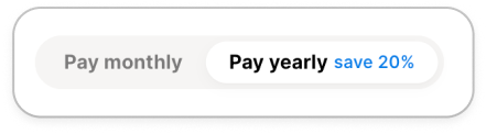
Adding £7 to each (aside from enterprise). Once I did this, I noticed another toggle-come-tab: pay monthly vs. pay yearly (save 20%).
So ofc, I play with this toggle too. Why are toggles so powerful? It’s not the toggle itself, it’s the feeling of control. It’s about autonomy (and a bit of fun). Toggles, calculators, sliding scales — anything to give the user a sense of customisation, empowerment and control — can increase engagement. Making people feel like they’ve curated their experience (even if it’s from a choice of two options). Why? Users feel more invested in the product when they can shape their own experience. The ability to make choices also fosters a sense of ownership over the UI itself. Really? Perhaps. I just thought it was fun to play with 🤸🏼 Now, onto Canva. The odd one out. Canva: Best for customisation
Canva, as expected, does a few of the basics that the others do:
Do you notice anything they do differently?
The price. It is per year. The first time I’ve seen a default per year price for a long time. Not only that, but there’s no charm pricing. We see £100 and £90, in the biggest, boldest font sizes in the columns. What’s interesting about this is it goes against what you’ll read on pricing. Often people say: make it smaller, make it look cheaper, make it a tiny font Instead, we see Canva boldly and transparently stating the annual price. Not only that, but it’s so clear how many people I’ll be paying for:
To be honest, I didn’t notice this until I annotated the diagram. But it’s SO transparent. And it gets better. I see they’re using toggles, calculators and scales (like Notion) to let people customise the page.
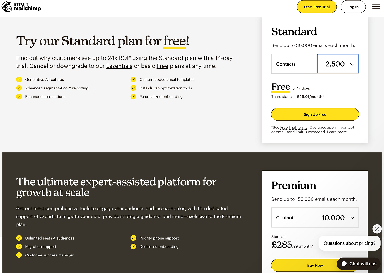
Bear in mind that these can be taken too far. Like Mailchimp (in my view). When people end up having to do mental maths or multiple calculations, then you’ve shifted from ‘make this easy and fun’ to ‘make this into a high school exam question’.
I don't want to use Mailchimp’s page. But I do want to use Canva’s. So, I have a play around. And to my utter delight Canva has some tiny UI details that change with the inputs. When I type 1, I see an outline around the Pro column. When I type 2, I see it move to the Team. And then I play around, I find that typing 100 moves the shiny outline to the Enterprise column.
How fun. Notice how the tiers are also all purple with a crown (premium branding) versus the grey block that is free. The pricing increases too, as you'd imagine. Showing me exactly how much I will pay. I suspect what’s happening here is the industry is changing. We get burned by big bills and long customer support chats for refunds. We get surprised by additional costs of random team members we forgot to take off. Instead of the old-school tactics of Charm Pricing, Framing and Anchoring, Canva has laid out all the costs bare. And I appreciate that. I wonder if it impacts the metrics...jury is out (my bet is yet, positively). In summary, there's no silver bulletThere’s some things that they all do (the basics of legibility and simplicity) and there’s other tactics that vary per tool (even some of the most standard pricing tactics). In a nutshell, the differences we see are:
With this diversity, it can be hard to know what to test first. We also never know when we’re seeing a loosing variant. So avoid a direct copy of anything you see, and instead take things back to first principles. Here’s a rough priority list of what to focus on, ranging from simple to complex. 10-step pricing fundamentals checklist
Would love to know what you’ve tried, what works and what doesn’t. Ping me with anything you’d add to the list ✍️ Fin. BIG NEWS, my articles are now online - WOO. Here they all are. To those asking for a more shareable format of article, there you go. See any issues? Just ping me. Let me know what you thought of today's newsletter. Especially the Loom - is it helpful? Turns out I can't embed audio with kit, would have preferred a tiny voicenote. Hey ho, let me know what you think in any case and I'll iterate. What next? There's a few options:
See you soon, 🕺 Rosie 🕺 |


Growth Dives
Each week I reverse engineer the products of leading tech companies. Get one annotated teardown every Friday.