Each week I reverse engineer the products of leading tech companies. Get one annotated teardown every Friday.
Growth Dives: Designing on thin ice
Designing on thin iceWhat the Scottish Avalanche App reveals about the stakes of product design While this is a story about app UI, it intersects with impostor syndrome in male-dominated spaces, cognitive biases in the mountains and more. Expect something different today ⛰️ Read online here
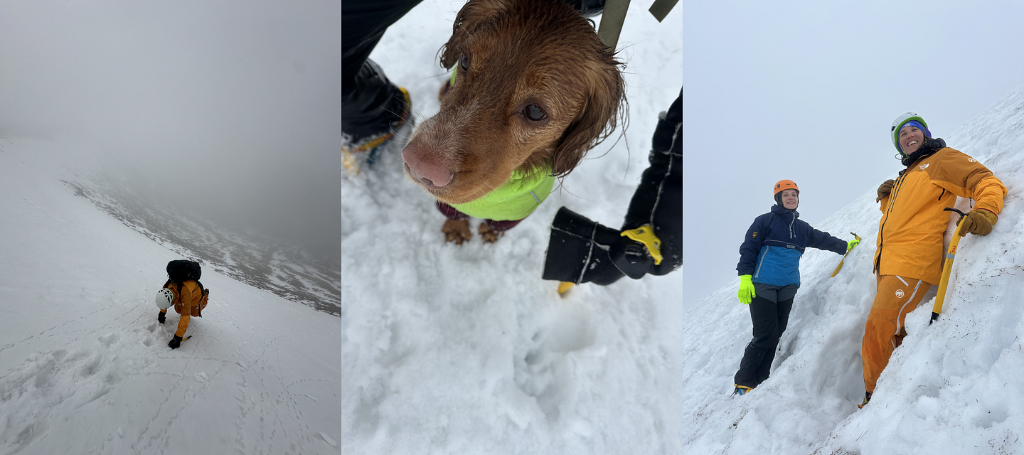
What are the risks of bad product design? Churn. Frustrated users. A flood of 1-star reviews. In the grand scheme of things, not much. Few apps are truly life or death. But a few days ago, I was introduced to an app that was actually a matter of life or death. Last weekend, I did a winter skills course in Scotland — which was incredible. Run by @navigationwithharriet, this two-day course for women and underrepresented groups in the mountains taught us how to navigate in white-out conditions, hike in crampons, use ice axes and plan routes that avoid avalanche-prone areas
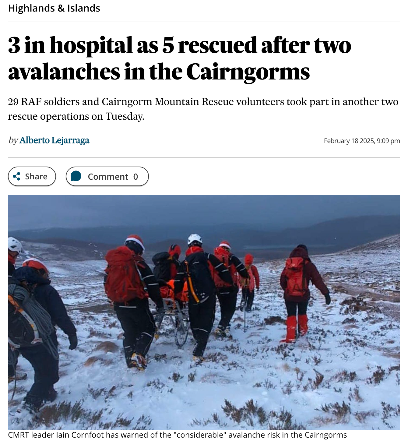
Every year, people are injured or die in avalanches — around 100 in Europe and 150 worldwide. In 90 percent of cases, people trigger the avalanches themselves — most often skiers, climbers, and snowmobilers. Many of these deaths could be prevented with greater awareness of the risks
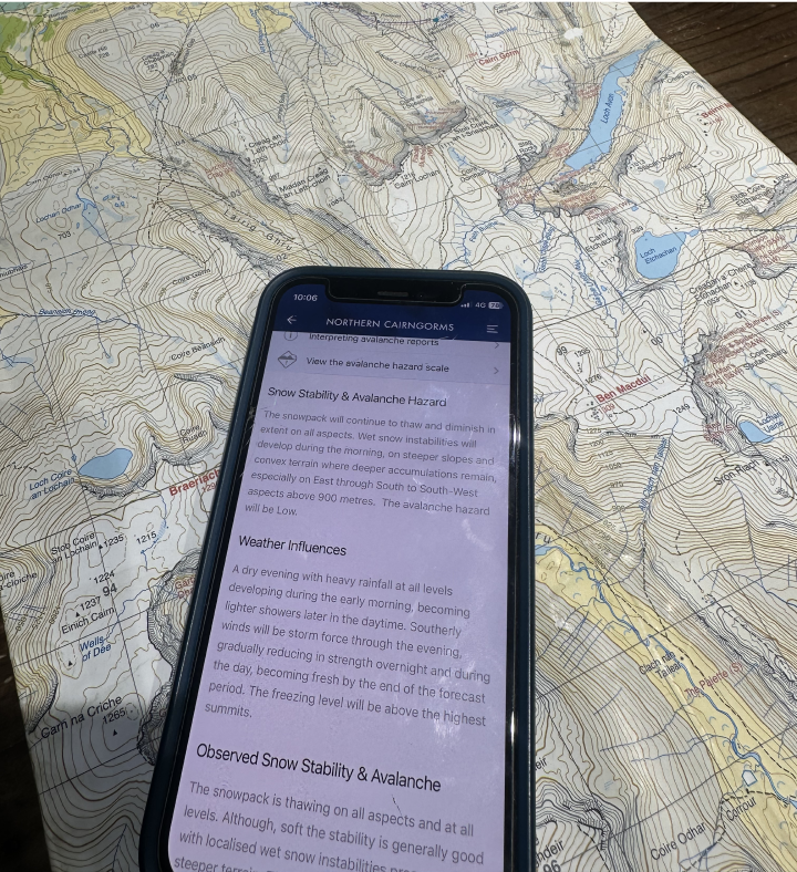
That’s exactly what the Be Avalanche Aware app is designed to tackle— helping people plan safer routes, understand avalanche conditions and make better decisions in the mountains. So, how well does it actually work in the field? Let’s walk through it, starting with where every mountain day begins: the coffee shop. Stage 1: App onboardingFirst, Harriet asked us to download BAA — Be Avalanche Aware.
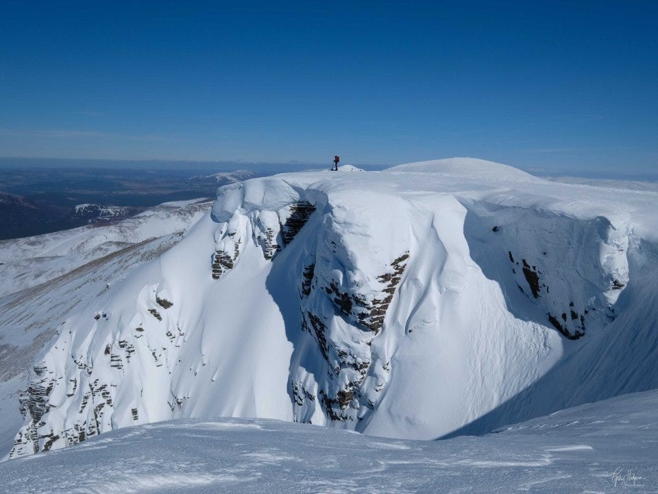
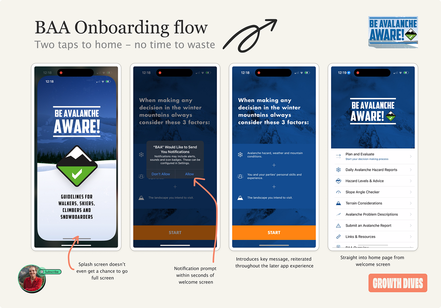
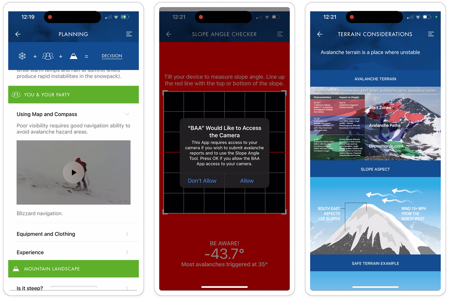
We were in the Cairngorms — a high plateau with vast areas above 1000m, including peaks like Ben Macdui at 1309m (I did geography at university, so I love this stuff). Our planning session covered slope angles (the danger zone is 30–45 degrees), wind speed (risk goes up above 15mph), wind direction, terrain traps, and more — pieces of the puzzle to figure out which slopes might be unstable. All with the help of this nifty little app. I downloaded BAA, expecting to have to halt all conversation while I skimmed through onboarding. But no need. What I saw was the shortest onboarding I’ve ever seen.
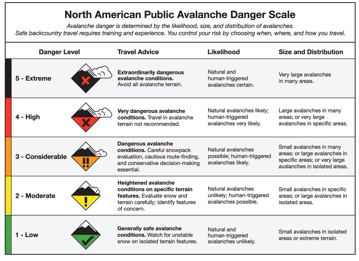
The app logo is the danger scale for avalanches (which we’ll analyse in more detail later) and it appears on the splash screen for a grand total of a second — so fast it was hard to screenshot 😭 It felt like I was being ushered through at lightning speed, which on one hand, makes sense: you want to get in quick and get the forecast. However, a short onboarding may be a problem in this context, because it could:
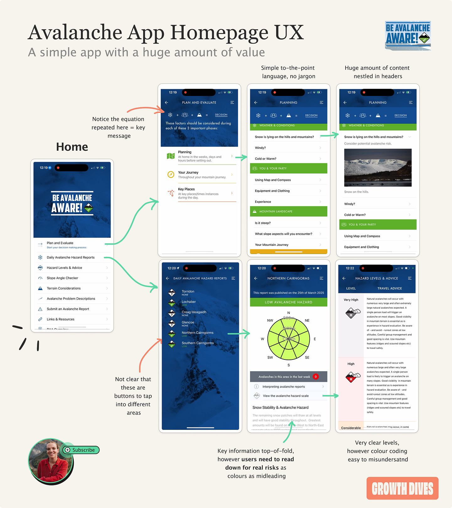
In mountain safety, you need users to slow down, reflect, and take things seriously. While a rapid onboarding gets people to the forecast quickly, it perhaps skips an opportunity to slow people down. Stage 2: Route planning UXI reach the app’s homepage and see the first options are:
What struck me was the huge amount of information in the app. It felt like the equivalent of doing an entire university degree on avalanches.
Overall, the benefits of this UX are:
However there are some drawbacks, namely:
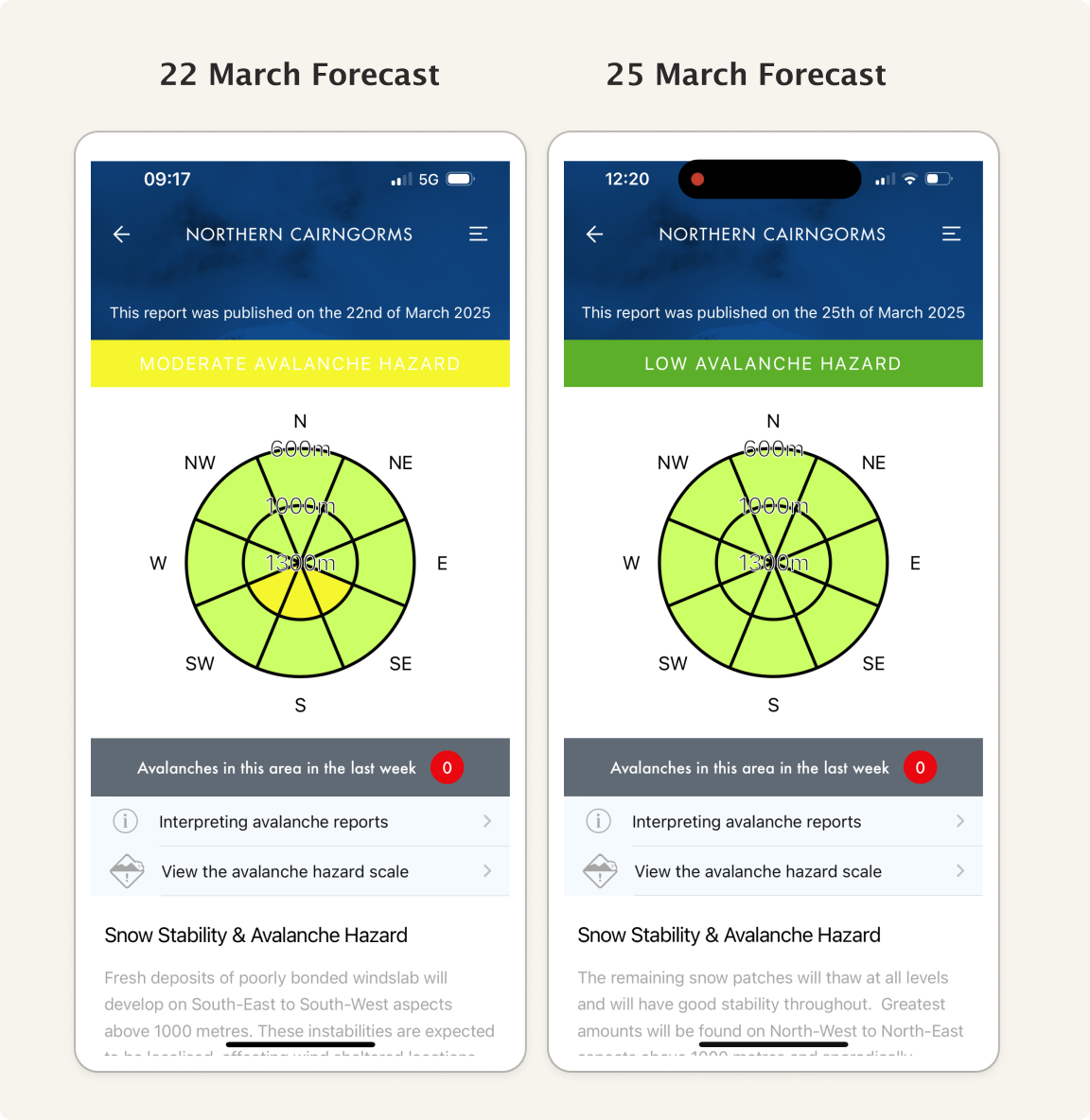
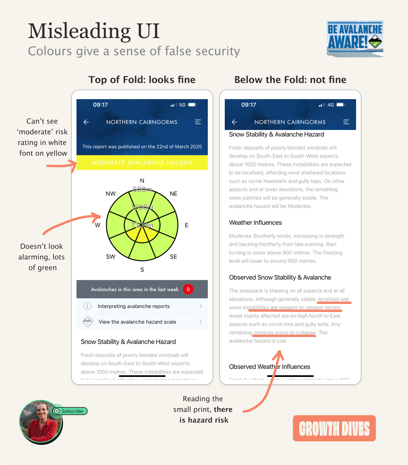
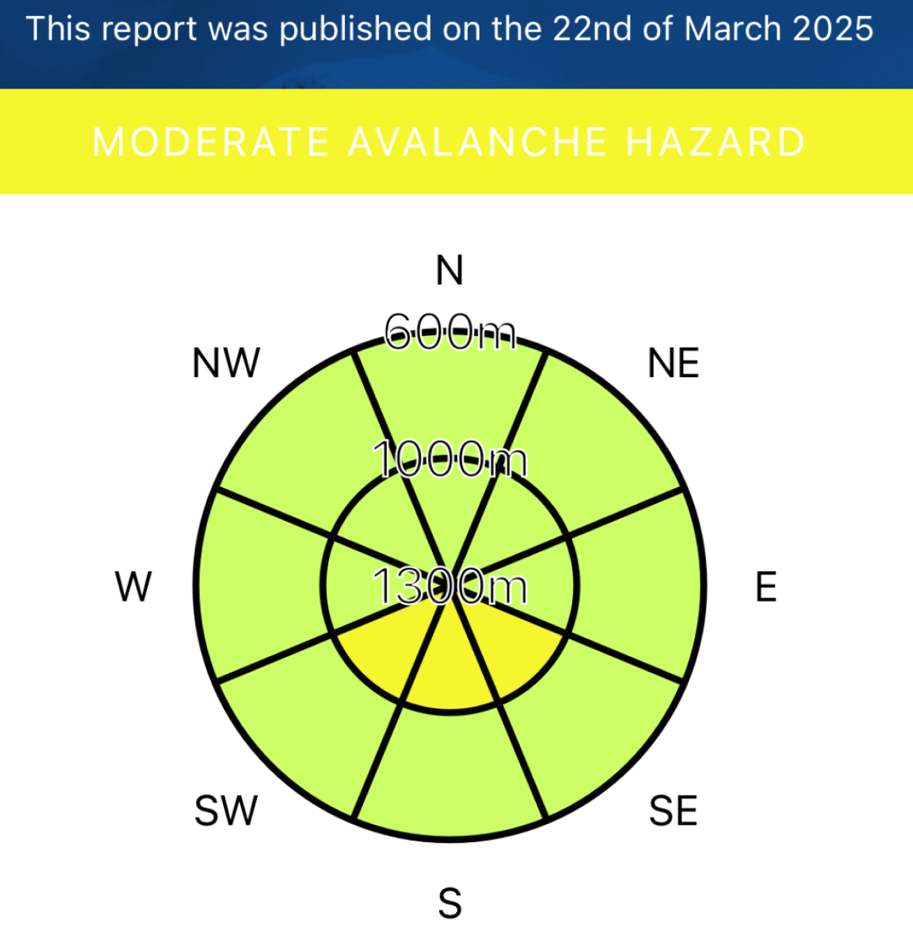
And this last part is the most important. When green means go (but it really means no)Here’s where the design starts to break down — and not just for beginners. The colours and icons used in the app look like green flags… even when they’re not. Take the forecast for Saturday and Tuesday this past week: I see two green pie charts, both with a banner above (one yellow and one green).
Looks like all green flags here. Moreover, note the “Avalanches in this area in the last week: 0.” Looks fine right? Wrong. Reading the light grey copy, we see that there’s “fresh deposits of poorly bonded windslab will develop…” along with “instabilities”. Also, the yellow banner reads “Moderate avalanche hazard” if you can even see it…
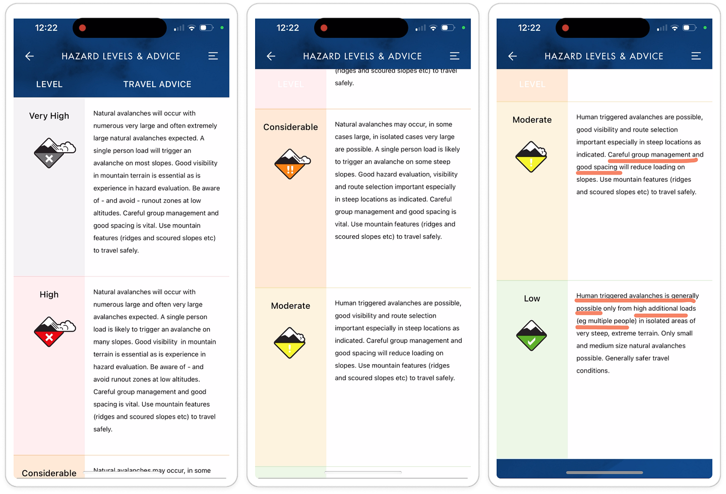
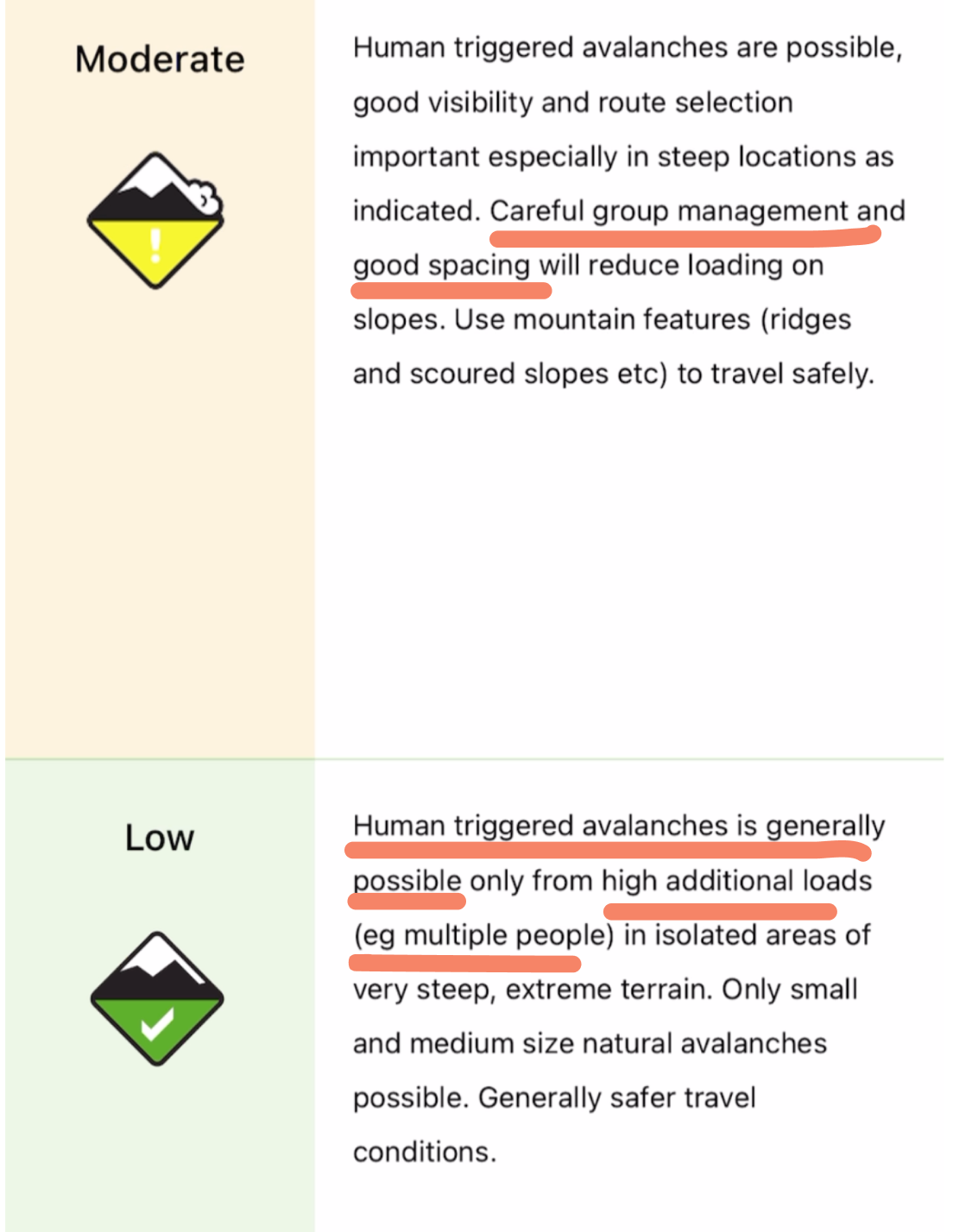
Okay, maybe Saturday isn’t as much of a green flag as we thought and needs more planning — but Wednesday is all green flags, right? Wrong again.
When we look at what constitutes a ‘low’ rating, the copy states: Human triggered avalanches is generally possible only from high additional loads (e.g. multiple people) in isolated areas of steep, extreme terrain I don’t know about you, but I don’t often hike alone. So, even normal group walks count as a “high additional load.” Harriet told us that it’s safe to assume there’s no avalanche hazard on one condition: when there’s no snow.
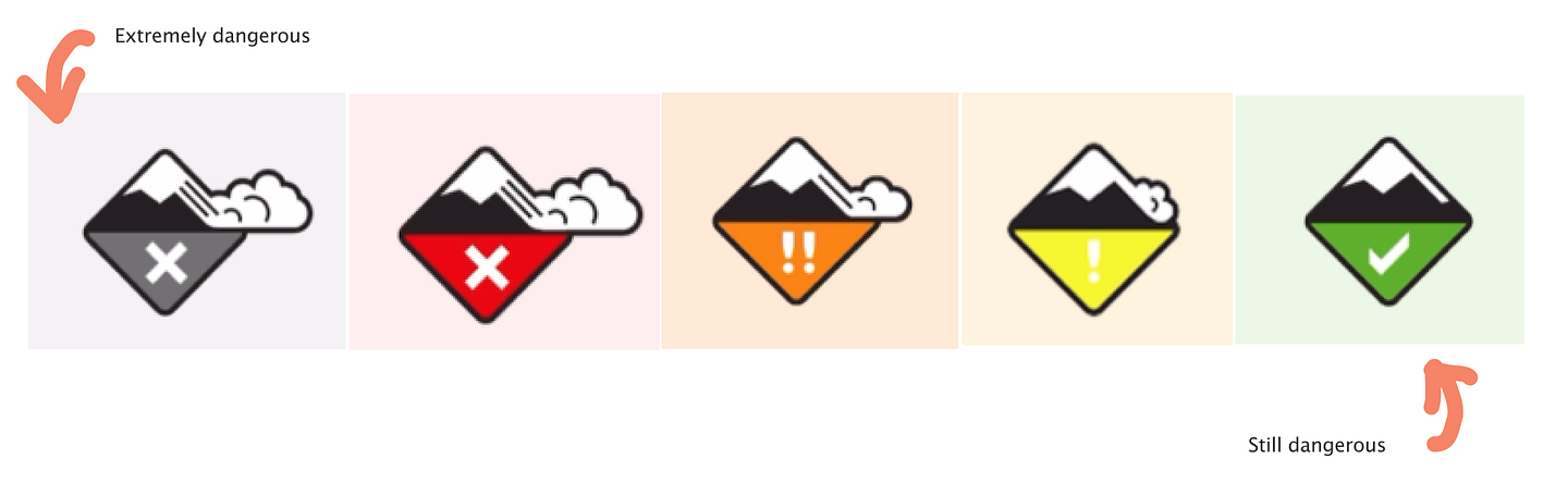
Not only is the colour misleading, but the tick within the hazard logo is too. The same issue applies to the ‘extreme’ logo, which is grey with an X — this feels more like an error or inactive state rather than a clear ‘do not go under any circumstances’ warning.
Note: I believe this scale is designed independent of the app and is the standard used in the industry. So not necessarily something they can edit. Avalanche warnings and other unread notificationsAccording to our instructor, the team that built this app did some research and found that the majority of people spend 5–7 seconds on the main hazard forecast page (AKA the pie chart). They scan the pie chart and don’t scroll further 🤦🏼♀️ This matches how we see users behave across the internet, where only about 22% reach the bottom of a webpage, and 57% of page-viewing time is spent above the fold. In the case of the avalanche app, this means that it is highly likely that a lot of people are getting the wrong impression from the pie chart alone. Especially newbies like me. This brings us back to earlier in the flow: the onboarding. The early flow could work harder to reinforce that people need to read it in full — perhaps through a T&Cs-style page during onboarding, where users confirm with an ‘I promise to read the full forecast’ screen or some other form of commitment. Mistakes are rife here, and not just in Scotland. A study on the perception of avalanche danger scales in North America found that 65% of participants perceive the avalanche danger scale to be linear, whereas it is actually exponential — meaning that as you move up the scale, the risk doesn’t just increase by a fixed amount, but multiplies significantly. 60% of participants avoid the backcountry at both ‘High’ and ‘Extreme’ levels and only 1/3 of people reported using the danger rating to decide to enter the backcountry at ‘Low’ danger levels.
I read this as: 40% of people are still travelling in the top two danger levels, and only 30% of people consider ‘Low’ to be worth considering. The conclusion? The warning system needs to be easier to understand, especially for people who aren’t experts. Stage 3: from theory to practice — up the mountain we goAfter planning our route to avoid the south, south-west and south-east slope aspects (the yellow bits) where the angle is between 30–45 degrees, we set out.
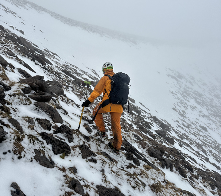
There I was, walking up a north-facing slope, heart racing at 170 BPM, listening to Harriet talk about what really causes avalanche accidents.
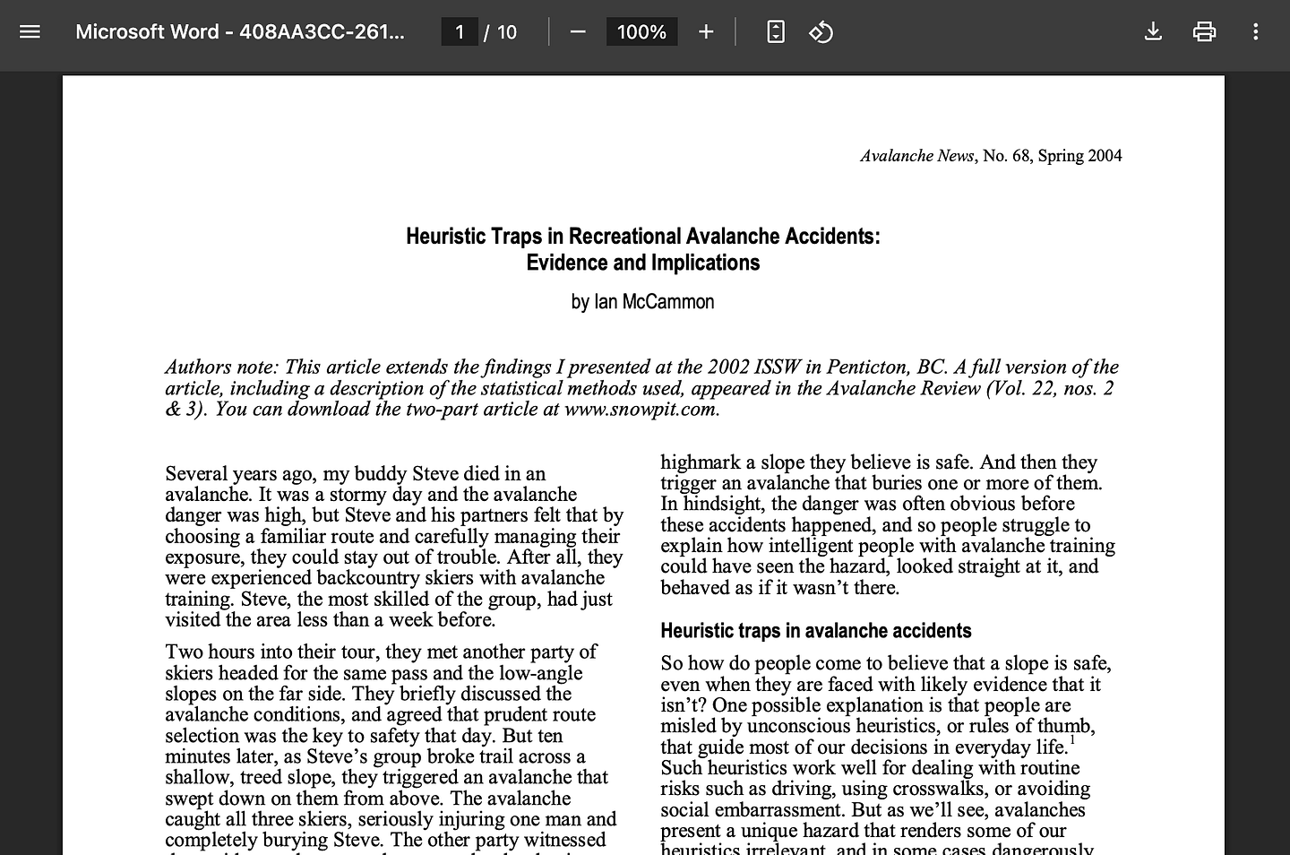
Turns out, it wasn’t just snowpack conditions or weather. It was our brains. More specifically, heuristic traps. In other words: cognitive biases but alpine 🧠 🏔️ Patterns of thinking that lead us to make fast but flawed decisions. As Harriet puts it: In the context of mountain adventures, heuristic traps often manifest when we rely too heavily on past experiences, feel less experienced, follow social influences, or perceived norms rather than carefully assessing the current conditions. So, even if we read the forecast correctly and plan the route right, we can still make the wrong decision in the moment. There are six big heuristic traps in the mountains (sound familiar?):
Harriet shared that “the most common traps I see women and non binary folks fall into are ‘expert halo’ and ‘acceptance’ (basically not speaking up in a group).” Turns out, the people-pleasers in us are dangerous too. These terms were coined into an acronym “FACETS” by Ian McCammon in 2004 to help avoid accidents in the mountains, based on his own experience of loss.
In product, we often talk about cognitive biases — confirmation bias, sunk cost fallacy, social proof. But in the mountains, the consequences aren’t poor metrics. They’re a lot worse. It’s important to call these out because then we can move towards safer experiences outdoors, as Harriet believes: The mountains are a space of freedom, challenge, and immense beauty. By understanding heuristic traps and how they can uniquely affect women, we can empower ourselves and each other to make safer, more informed decisions in the wild. Remember, your voice, experience, and judgement are invaluable tools on any adventure. Let’s embrace them, trust in our abilities, and navigate the mountains with confidence. In conclusion: the app does what it can, the rest is up to us.There’s only so far an app can go. Digital tools - especially free apps like BAA - need to be one piece of the puzzle: weather, route planning, skills, experience, equipment and sticking to what feels right. Yes, the logos are confusing and the onboarding could help build better habits that encourage people to pay attention to detail. However, for the service it provides for free, the app is an excellent resource. And finally, thank you to the people who trek up the mountains every day to do snow pack analyses to inform the forecasts, to Fleurine for editing this and to Izzy and Harriet for a great trip 🫶 Fin Thoroughly enjoyed all the tangents this week - let me know what ya think! See you next week, 🕺 Rosie 🕺 |
Growth Dives
Each week I reverse engineer the products of leading tech companies. Get one annotated teardown every Friday.