Each week I reverse engineer the products of leading tech companies. Get one annotated teardown every Friday.
Growth Dives: Duolingo's 6-step reactivation experience
Duolingo's 6-step reactivation experienceIt's not just about getting users back - it's about what happens next. Read online here
I hadn’t opened Duolingo in three months. But with a trip to Spain looming, I tapped the green owl — expecting the same experience as before. But something had changed. Instead of the normal homepage, I got a new reactivation experience: a cute sleeping owl, a check-in, personalised copy and a CRM series.
When I re-opened the app, I saw:
The reason this is so interesting to me is because lot of reactivation literature talks about how to get users back, not about what happens after that. It’s as if you’re at one of those tourist restaurants: the waiter hard sells to get you in the door. Then, once you’re sat down they take ages to serve you. It’s the same with reactivation. Many products invest in retargeting, offers, and churn flows but then to forget to do anything once people are back. Not Duolingo. With 300 million users and 7 billion exercises completed a month Duolingo has had its fair share of churn. But unlike most, Duolingo doesn’t just work to get you back — it designs the experience to keep you there. SO 👏 let’s dive into how Duolingo turns reactivation into retention —starting with the 2025 welcome back flow which, interestingly, seems to have changed since 2024 👀 Stage 1: Welcome back UXEight weeks before my Spain trip 🇪🇸 I head back into Duolingo. I see the blinking owl loading screen (in Duo’s bright green) followed by a new flow I’ve never seen before.
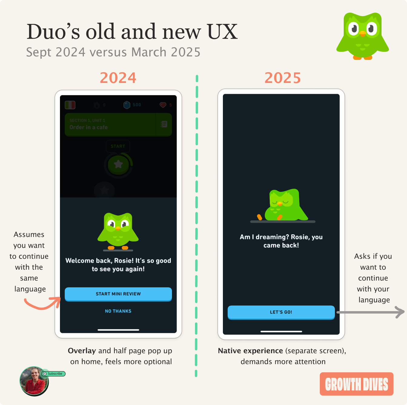
The owl is gently sleeping — the animation making it look like he’s breathing softly — with the copy: Am I dreaming? Rosie, you came back! The owl then wakes up, jumps up, spins and looks super excited to see me. The animations are something that came into the fore since 2018. Duo first became 3D in 2012 and after that only had two states: happy state and crying state.
According to Duolingo’s Chief Product Designer, Tyler Murphy the 2018-onwards Duo was designed with animation in mind:
We’re using very simple geometry. His wings are just half circles hiding behind the body. And when you do a turnaround, or look at him from the side, he’s very predictable as far as what his shape is. He’s more or less a cylinder with wings, and that made the animation and illustration time go down drastically. I think our animators really appreciated that. And now we can put him in more places throughout the app.” — Tyler Murphy, Chief Product Designer @ Duolingo
With this animation, I felt welcomed back. It almost cleared the elephant in the room i.e. my expectation that Duo was going to guilt-trip me. Instead, the owl just looked happy to see me. Once Duo calmed down, I tapped ‘LET’S GO’ and saw: What would you like to learn? With two buttons: Keep learning Italian and start with a refresher
Take a different course and learn something new!
Both of these are written in user-centric, conversational language but with an up-beat, motivating tone. They also use icons to help you scan the options. These flows are key — not just for retention, but for getting reactivated users back to value quickly. I spoke to Max Amelang, Product @ Prematch, who’s tested this in practice: ‘If you think about it, reactivated users haven’t seen an onboarding or a paywall for ages. That’s why welcome back flows are so important. In a past role, I’ve seen these flows massively improve the chance people stick around once they’re back and even drive significant revenue’. The important thing here is to reiterate value and get users to your magic moment ASAP. Looking through my ever-growing folder of screenshots, I noticed something: back in September 2024, I saw a similar welcome back screen — but it was executed differently.
For one, it was a half-screen overlay — you could still faintly see the homepage behind it. That made it feel more optional, reinforced by the ‘no thanks’ CTA.
In 2025, I have no optionality on the welcome back flow, I have to opt into the CTA ‘LET’S GO’, like I’m making a mini commitment. I also get asked whether I’d like to continue or start anew, which feels less presumptive compared to 2024 version that assumes I want to continue with the same language. Notice how the 2025 version is a full-screen experience, not just a half-screen overlay. It feels more embedded in the app’s flow — more immersive, harder to ignore, and commanding of attention. I’m curious to know whether this is a new variant, or whether they’re both live and simply triggered after different conditions are met. Anyhow, within the next 10 minutes, the emails start 👀 Stage 2: High-frequency CRMIn the CRM review of Duolingo I did back in Sept, we saw a high-frequency, high-emotion email series that ultimately paused itself when I wasn’t interacting.
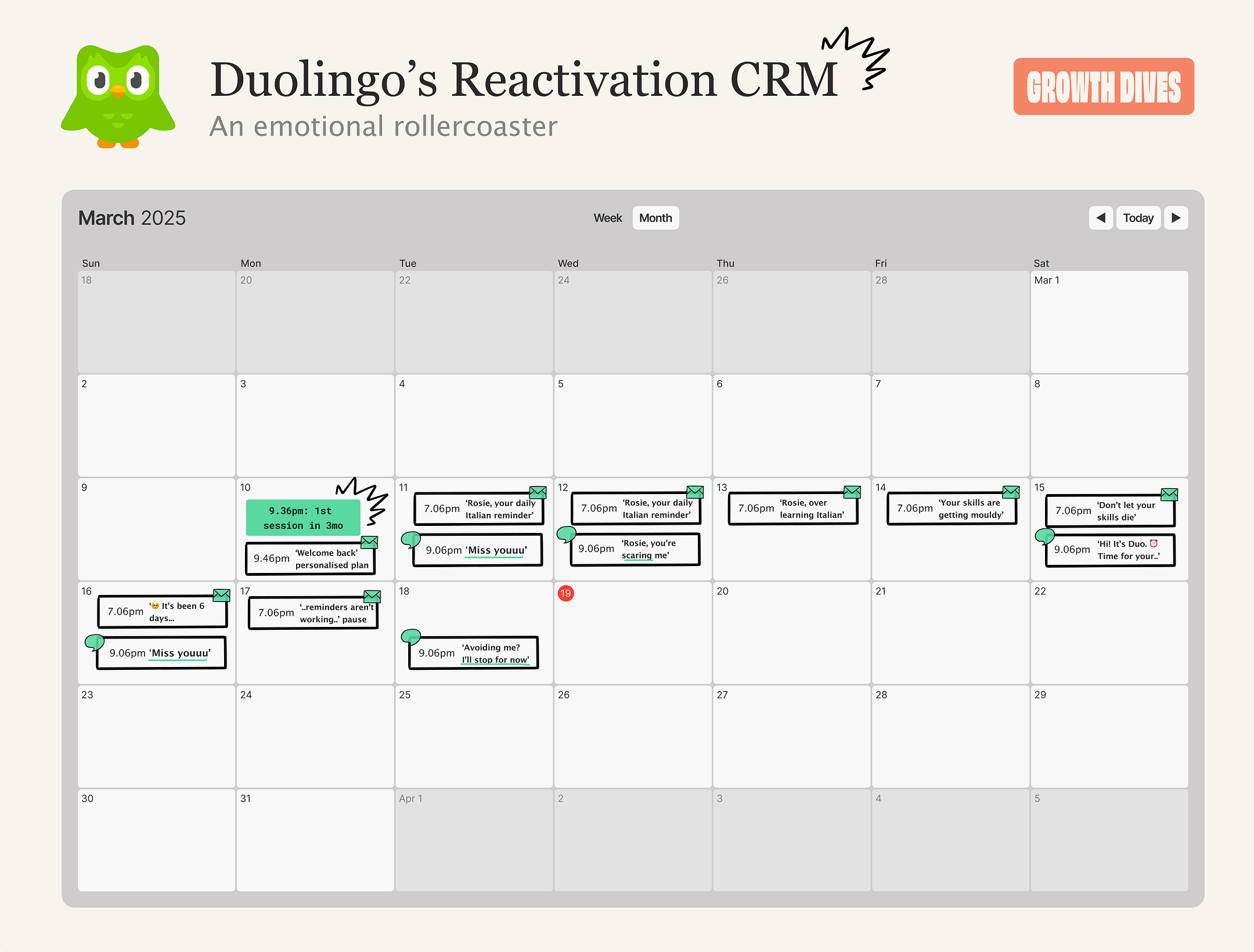
Back in September, the email volume was intense — sometimes twice a day. This time around, it was still frequent, but felt slightly more dialled down.
Across 9 days, I saw:
Note that I could have missed some pushes, I’d almost expected them to be daily (same as email). The welcome back email was a highlight of this experience for me.
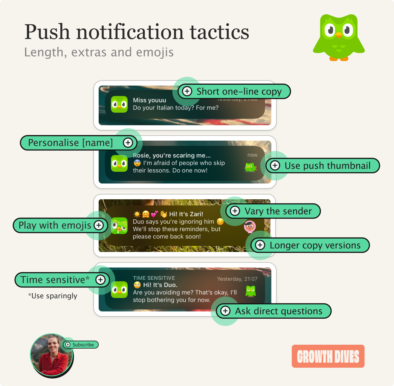
Specifically, in email there’s a few cool details:
It also covers off the main criticism of Duolingo: that people don’t actually learn the language. Notice how, just below the action-focused opening, the second block reads:
Spending 30 minutes a day practicing Italian can get you to the same reading and listening level as 4 semesters of university language classes — with a citation underneath. What’s key is the reactivation comms is covering off potential reasons that people churn, the ‘I didn’t learn anything’ reason. Next, the welcoming, warm language quickly escalates to the good ‘ol psychologically unhinged owl. Stage 3: ‘cut through’, emotional copyDuolingo’s messaging descends into psychologically-questionable tactics within as little as three days.
My second push on day three is: Rosie, you’re scaring me…
😨 I’m afraid of people who skip their lessons. Do one now!
This guilt tripping is morally questionable, especially for an app rated as 4yrs +.
What’s interesting is the timing. I opened the app at 9.36pm. For the welcome back email, it was sent at 9.46pm: 10 minutes after my app open. For the subsequent emails, they’re sent at 7.06pm. My push notifications on the other hand, arrive at 9.06pm each night: 30 minutes before my app session time. Perhaps, Duolingo has found its optimum push notification and email send times:
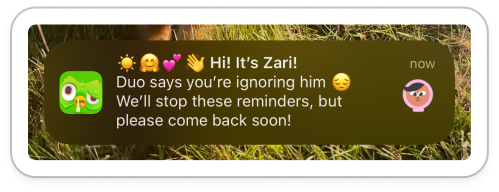
The general rule to take away here is that triggers work best when they’re tailored to each user’s behaviour — especially the time and day they tend to engage. A lot of CRM platforms will do this for you now with settings like ‘intelligent delivery’. I like to set them manually however, so I know what’s going on and can avoid duplicates sending all at once. Stage 4: A welcome pauseAfter a wave of emotional push notifications and emails, the eighth one finally backs off with Duo’s iconic ‘these reminders don’t seem to be working’ message.
The next day, my push notifications follow suit.
There’s another variant from last year I have, which is from a different character in the Duolingo world: Zari.
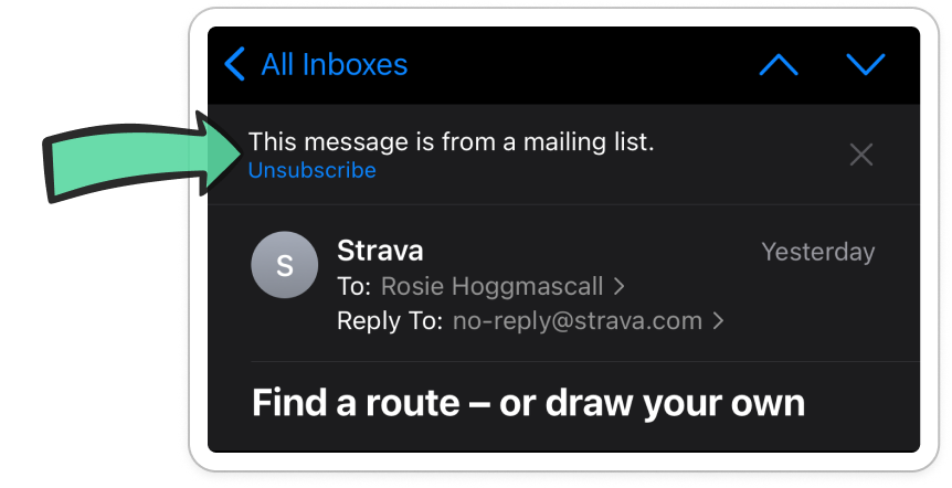
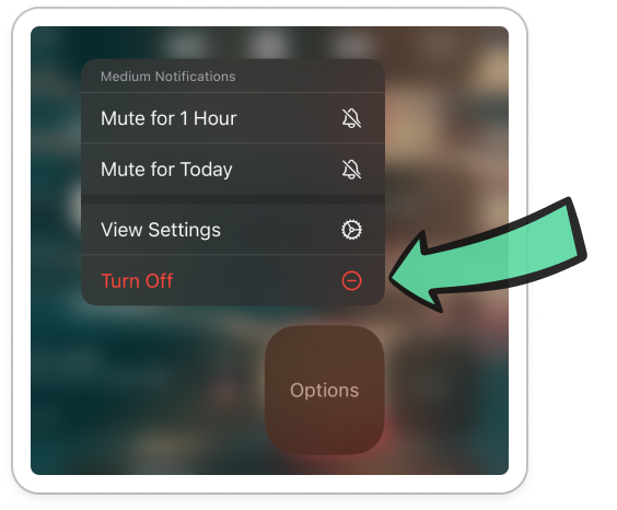
What’s important here is the CRM team are trying to avoid me unsubscribing forever. This was my notification screen back in September:
Intense AF. Now more than ever, it’s easy to unsubscribe — from both email and push. Just one tap in Apple Mail, or two taps from your notification centre.
Which is exactly why it’s so, so, SO important to back off when needed. You can use logic like:
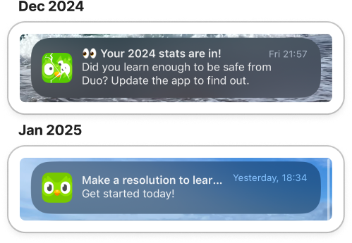
If you have the analytics capabilities, you want to turn them off slightly before the average time to unsubscribe. Once the notifications are paused, calm ensues 😮💨 Well — aside from the odd seasonal campaign. Stage 5: Infrequent seasonal notificationsAfter Duolingo pauses your notifications, only seasonal campaigns get sent. For instance, after my last session in September 2024, I received only a few notifications from Duo: a 2024 stats recap and a new years’ resolution campaign.
This is when something interesting happens: infrequent notifications start to cut through better. Why? Well there’s a few potential reasons and psychological principles at play:
Remember a key rule here: it’s important to keep them infrequent until you’ve reactivated the person. Else you risk an unsubscribe. Beyond the pause, Duolingo uses a mix of other push strategies to grab attention.
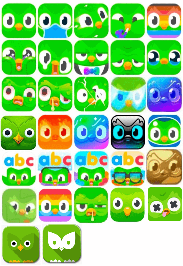
Test all you want — but if you’re pushing people to unsubscribe, you’ve already lost. Sometimes, no message is better than a bad one. Stage 6: Last-ditch attempt to grab attention with the app iconWhen all’s lost: your notifications aren’t getting clicks, your users haven’t had a session in yonks, what is there left to do? In terms of the app, you have little left in your arsenal. At this point, external triggers are the biggest levers to get users back in. Things like reactivation campaigns (if you run ads) and brand campaigns (across social and PR to remind people you exist). But Duolingo found one last thing they could change: the app icon. There’s been over 38 different variants of the Duolingo app logo.
I myself have experienced three: the normal app, the snot owl, and the ‘revive owl’. Whilst my app icon is forever unwell, my partner’s is basically on fire — thanks to his ability to keep a long streak going 🔥🔥🔥
It’s a small detail — but it’s also the perfect example of how Duolingo blends brand, behaviour, and psychology to re-engage people in weird ways. And it’s not as easy as a logo change, but the brand buzz that goes with it.
This is really where the brand and marketing teams come in to re-ignite buzz for the app, drive reactivation and new acquisition of learners. All of which brings us to the bigger picture. To conclude: reactivation isn’t enough — retention is the end goalWhat can we learn from all this? As per last week’s newsletter: you shouldn’t blindly copy a competitor or best-in-class. Instead, strip it back to core principles, challenge your assumptions, and focus on what your users actually need. Here are the five most important takeaways I’m drawing from the Duolingo case study:
Reactivation is a super hard one to nail but so worth it. Would love to hear if you’ve tried any of these and the result 👂 fin I loved writing this one - not just because it was interesting, but because I had some lovely scenery on my train ride while I wrote 🏴 Off to Scotland for a winter skills trip! Exciting. See you next week! Rosie 🕺 |


Growth Dives
Each week I reverse engineer the products of leading tech companies. Get one annotated teardown every Friday.