Each week I reverse engineer the products of leading tech companies. Get one annotated teardown every Friday.
Growth Dives: How Canva reduces trial cancellation
How Canva reduces trial cancellationA round of applause for personalisation, transparency & trust 👏 Give this post some love on LinkedIn here 🕺
The eye-watering numbers just keep coming in for Canva. Last year, it hit 15 billion designs published. This year, it hit 185 million monthly users.
After focusing on the creative industries in the early years, Canva went after some new segments to drive their insane growth curve:
As well as new segments, Canva’s going after new markets 🇺🇸🇺🇸🇺🇸 This year and last they’re pushing big in the US. The US is now one of their biggest markets, with 20% of their 2023 designs created on the platform being creating in the States. What next? Well there’s quite a lot actually. Apparently Canva are ‘only 1% there’. 🥴 There’s now a “Hollywood work kit” as Canva goes after the film industries (think creating storyboards and movie posters in half the time). There’s also courses, an increasing number of AI features, bulk creators (that can create 1000s of creatives from CSVs), Loom-like recordings and more. What a wild ride. And even so in the last 5 months since I last covered Canva. Earlier this year I did a deep dive on Canva’s onboarding personalisation. I was amazed to find out that 2024 is the 7th year of profitability for the design tool. A track record that is rarer than it should be for startups. The most recent revenue stats report $2.3 billion in annual recurring revenue for Canva. That’s $6.3 million per day. And $22K for the 5 mins it’ll take you to read this deep dive. However, when I dug deeper into their user experience I wasn’t so surprised. I saw personalisation, customer-centric language, ethical UX flows and a lot of good stuff. However, as much as I love it. I don’t use it enough. I’m so well-oiled on Figjam (where all my diagrams are made), it feels too hard to switch right now. So, I cancelled my Canva trial. And here’s how it went.
Trial Cancellation from home, via the new redesignI headed to my homepage on Canva a browser to find a ✨ new look ✨ that has been rolled out gradually to the whole Canva userbase. I could tell something had changed in the homescreen UI but couldn’t quite put my finger on it. Then, I see this popup: Turn on the glow up for your team
There’s a few things I love here in this product launch pop up:
An excellent piece of product marketing. When I tap ‘see the glow up’ I get taken through a full-screen animation with social proof (apparently I’m the 27th million person to find the glow up).
Then I’m thrust through a light tunnel animation which ends on the homepage with Canva’s fun confetti:
The changes are described by the team as being a more ‘fresh, focused Canva’. I agree; I feel less claustrophobic than before. The UI feels more like an app or a product, versus a flat webpage. The changes I can see are:
And so much more (please do reply with what else you see, would love to get some experienced designers’ views).
Anyway, distracted as I was by the video and new homescreen, I had work to do. I was there to cancel. So I tap my name icon top right and get to a menu. I tap settings (listed first) and get to my account.
From there, I can see ‘Billing & Plans’ 5th down the options on the sidebar. So, I click it and get to the page where I see my payment method, a summary of my subscription and the option to ‘change plan’ when I click the three dots.
Tapping the 3 dots gives me a lil’ menu with ‘cancel trial’. On the whole, easy to find. There’s no frustration here. There’s also no delight, but that’s OK — you don’t need to be delighted in a cancellation flow. As long as you don’t get in the way. Five clicks from home, I’m onto cancellation. First Screen: some ✨ personalisation ✨This is my favourite part of the flow. When I initially went through this flow, I didn’t notice the personalisation.
After tapping ‘Cancel plan’ I get a pop up on my screen with the background greyed out. The pop up has:
The number of days left is personalised, but not much else. Or at least that’s what I thought…. Then, I saw a post from PLG Advisor & Growth CoachAndrew Capland on LinkedIn:
I thought perhaps Canva had iterated on this screen in the short time between my experience and Andrew’s? Then I realised: it’s just really well personalised.
The best parts of this screen are:
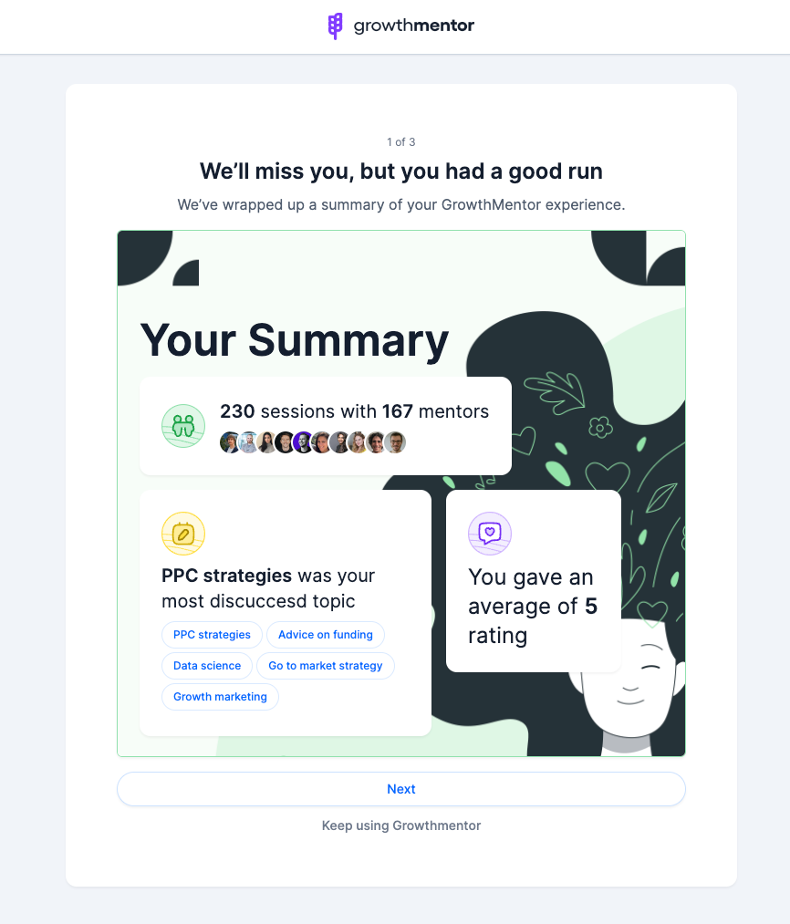
What’s interesting is that the third example doesn’t have the 7-day reminder. Perhaps this is an old variant, perhaps it is that Andrew had 3 days left of the trial, I had 29 so he doesn’t qualify. In Andrew’s original post, Founder of Growth Mentor, Foti Panagiotakopoulos, shared that they’ve executed something similar in their mentoring platform:
As does Loom. I wrote a deep dive on Loom’s cancellation sequence a few months back, find that they have implemented something similar as their final screen in the cancellation sequence.
What’s cool is that this actually reduced churn for Loom. One of the senior product designers who worked on this flow, Crystal Ma, shared that this project’s codename was named ‘Graceful Goodbyes’ and was aimed at providing a positive off-boarding experience for users. The team managed to increase retention as a result 💥
Unlike Andrew however, I haven’t got the most out of my Canva trial. So I go ahead and click ‘continue cancellation’. Cancellation Flow, continuedThe next screen asks the common question ‘why do you want to cancel’, crucial for the team to mine for opportunities in the responses. (If you don’t have a churn survey live, I’d recommend putting one in). The secondary CTA changed from Remind me later to Keep Canva Pro, and the image changed to show how I’ll be missing out on the image library without Pro.
Clicking ‘continue cancellation’ a second time cancels my trial. It’s as easy as that. The next screen confirms my choice with a green box of text, which states clearly when my trial will end.
I’m then given the option to give more information about why I cancelled in a free text entry field. Nice touch that this doesn’t come before my cancellation. Canva have prioritised quick time to cancellation, then gathering extra feedback as a fast follow. The image on the right is a friendly looking man leaning over a desk with a pencil, like he’s about to take my feedback on board (or take my coffee order).
Post-Cancellation ExperienceBack on the homescreen I get a black pop up, again confirming when my access will expire.
This is the fourth time I’ve been told when my trial ends, but I’m not annoyed by it. Quite the contrary — this is best practice. According to (some rather old) research from 1956, people need to hear or see information between five to nine times in order to remember it. My details on my billing screen also change to show me the end date of my trial, so that’s five. The one thing that’s missing in this flow for me is an email. I received nothing in my inbox that confirmed my cancellation. And it’s been 48 hours now. Compare that to Loom, which sends an email 1-minute after cancellation confirming the changes an extra time.
Conclusion: an easy breezy cancellation flow from Canva. I’ll be back.It’s not a goodbye forever with Canva. It’s a ‘I can’t be bothered to learn a new tool right now’. What I appreciated is how easy it was to cancel. This means that I’m left with a positive lasting impression of the brand — there’s no negative emotions there. Meaning that when I am coming to my second purchase experience (the the future), I'm coming with more motivation. I am very intersted to see if Canva can challenge Figma to become a tool for product designers and engineers in the future. Hasn’t quite happened yet, but I wouldn’t be surprised if it is on the horizon. In the meantime, here’s three takeaways from Canva’s cancellation flow:
To sum, here’s my journey in a nutshell:
Join the discussion on LinkedIn Thank you SO much for reading (all the way to the bottom, wow look at you go). What next? There's a few options:
See you soon! Rosie 🪩 |


Growth Dives
Each week I reverse engineer the products of leading tech companies. Get one annotated teardown every Friday.