Each week I reverse engineer the products of leading tech companies. Get one annotated teardown every Friday.
Growth Dives: How Slack drives activation with empty states
How Slack drives activation with empty statesOnboarding, delightful copy and the element of surprise Read online here
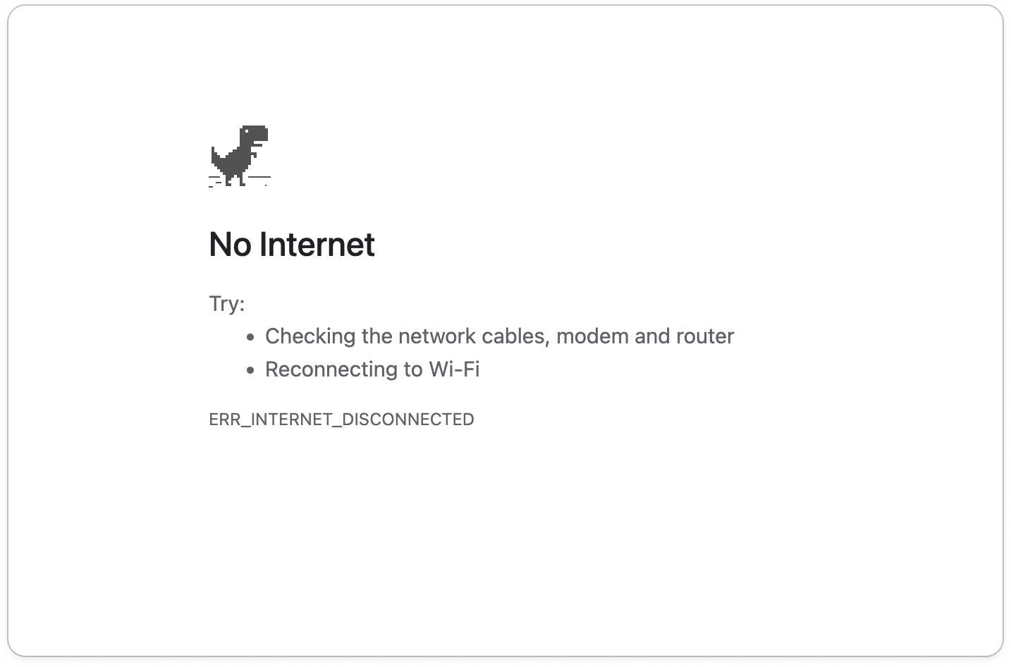
Do you know the dinosaur? The ‘Lonely T-Rex’ of Chrome.
Or perhaps you’ve seen the ‘Blue screen of death’ on windows.
Or maybe Apple’s ‘Spinning wheel of death’ ☠️
Pre-auto save these signalled the end of the world. Lost files. Reboots. Frozen screens. Seeing these stirs feelings of frustration and dread (as the names suggest). These are what we call empty states. Empty states are what you see when a page or area that could be blank. Like a search bar before you’ve started searching, a chat before you’ve sent a message, an error state or a new document you’ve opened. They are non-spaces where there’s technically nothing to display. As a result, these are spaces that are often overlooked in product design. However, they’re actually incredibly important in creating positive user experiences. Why? Well, because:
According to NNGroup: Totally empty states cause confusion about how and whether the system is working. An empty screen leaves people with questions: Is the system finished processing the request? Is content still loading? Did an error occur? Did I set the wrong filters or parameters? The overarching goal of empty states is to build confidence that your product know’s what it’s doing and show you’re in control. What better way to explore this unloved area of UX than to look at one of the best examples. Slack. We’ll look at four types of empty states from Slack and show how they help onboarding, product adoption and reduce confusion throughout the experience, namely:
Before we dive in, here’s a recap of Slack’s growth from origin through unicorn, and from acquisition to now. Slack’s rather bumpy ride from 2013 to 2025Slack is one of the startup world’s biggest success stories, having gone from nothing to unicorn status ($1bn) in as little as 8 months. It started as an online multiplayer game called Glitch in 2009, however the team struggled to gain traction; the game was too complex, too slow and ultimately flopped. Instead, the team noticed that their internal communications tool they’d built to create the game was much more interesting. And hence, Slack was born. After launch in 2013, Slack grew 5–10% weekly in the first year and reached unicorn status not long after in 2014. By the time I tried it first in 2019, Slack had reached 10 million daily active users. Slack’s strong growth was due to a mix of factors: timing (as remote work grew), brand (goodbye stuffy enterprise tools, hello fun), strong backing (from Silicon Valley) and product-led growth (easy to get going and share with others). In 2021, Salesforce bought Slack for $27.7 billion. Funnily enough, after the acquisition growth slowed. TechCrunch reported that growth dropped rapidly, from “46% YoY in Q3 2023 to just 16% in Q4 2024.”
Nevertheless, in 2025 Slack now has 200,000 paying customers across 150 countries, including 77% of Fortune 100 companies. Still eye-watering numbers, despite the growth slump. I’ve been using Slack for five years at this point but I can still remember that early days 💭 One of my earliest memories of the UI is the empty states in their best feature: the search bar. Empty states in search 🔎I remember the first time Slack surprised me with its empty states. I was typing in the search bar, when I saw some entertaining copy: ‘Surely that’s around here somewhere’ Huh? So casual. So unusual. The next time I hit the search bar, I read: “Search high and low”
The default copy in the search bar changes on each click — it cycles through various weird, fun and (occasionally) useful copy. It feels almost crafted instead of engineered. What this does is two-fold:
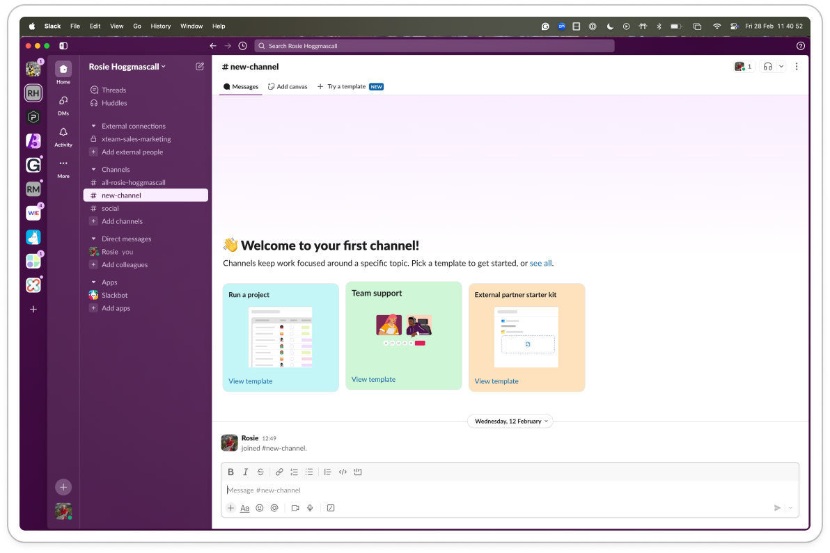
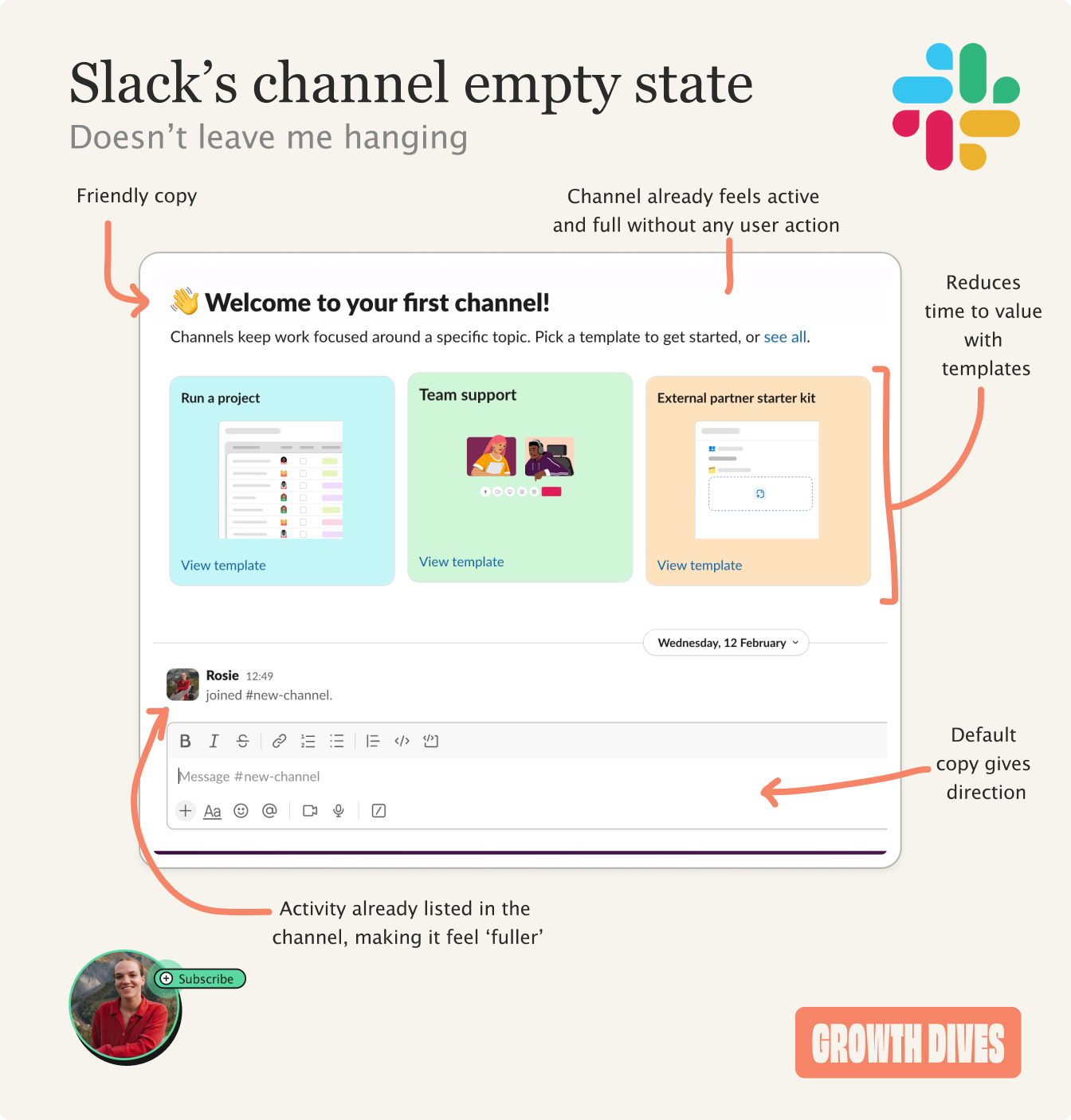
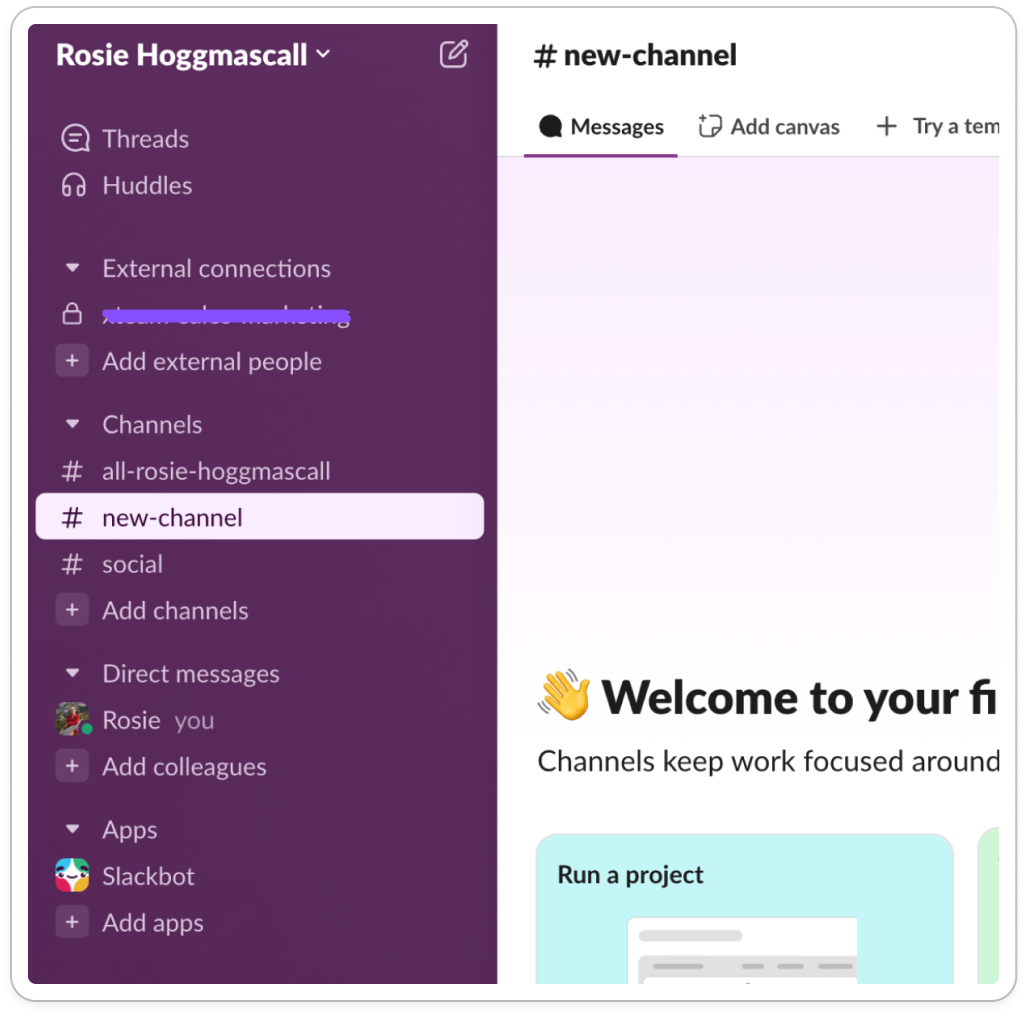
Both of these tactics drive engagement, as well as improve awareness about the search feature. The injection of fun and personality into mundane, functional elements is one of the reasons Slack has been able to differentiate in a crowded market. It’s a great example of how to turn mundane UI elements into engagement opportunities and memorable micro interactions. First use 🐣 onboarding empty statesMore recently, I created my own Slack workspace for the first time. I needed to use Slack connect, and so created ‘Rosie Hogggmascall’s workspace to accept invites to new clients. It was the first time in five years I felt like I was seeing Slack with fresh eyes. The first thing I saw was the empty states within channels.
Notice how there’s no blank page. Instead, I see activity (myself joining), templates, a welcome message and direction of what to type.
Without taking any action, my workspace feels active. I also see that not one, but three channels have been created for me.
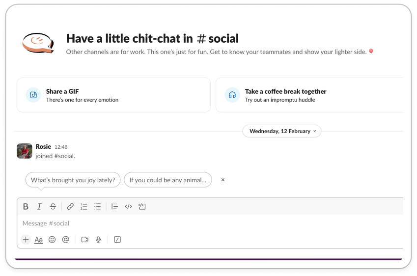
All with their own empty states, including:
The suggested actions feel subtle and easy, things like:
However they’re all driving to core actions that help you engage, onboard and get set up.
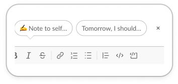
There’s even an empty state for a DM with myself.
The default copy ‘✍️ Note to self…’ and ‘Tomorrow, I should..’ makes me feel so seen, given that’s what I typically use a self-DM for in WhatsApp, Messenger or Slack.
What these do is avoid users drawing a blank. Opening a new page is akin to walking through a doorway: you forget what you came for. You draw a blank. That’s what these empty states are avoiding. They are simultaneously:
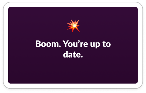
Notice how Slack anticipates and solves for common friction points before they arise. By avoiding friction, providing structure and reducing cognitive load, Slack creates motivation and momentum that carries new users through critical activation steps (like first message and channel creation). What’s key is that they feel helpful rather than intrusive. Instead of tooltips, repetition or popups, the use of entry states to onboard users feels like the natural flow of the product. Cleared tasks ✅ End-goal empty statesNext up: task complete empty states. On Slack mobile, there’s a feature called ‘catch up’. It’s a tinder-like style summary of the messages you need to catch up on. Once you’ve swiped through your messages, you’re met with a little congratulations message.
Similar to the variable reward we saw in the search bar copy, this copy also changes every time — moving from cool, to hype-man, to chill:
(Not sure why there’s an apple there?)
Again, these small, quirky messages inject personality. Consistent moments of personality across different features help create a cohesive brand experience, which is distinctly cooler, more casual and different from competitors (Teams would never say ‘boom’…). As well as being important for brand, they’re also functional. These messages signal task = complete, and provide closure. Marking the dopamine hit of a finished task, reinforcing the habit loop. Next: error states. Uh oh ☠️ error empty statesTo test error states, I do two things:
For the first, I see what’s called a skeleton state ☠️
It’s a loading state that shows what the UI would look like if there were results. Giving the perception that things are moving, filling the void instead of leaving it blank and removing the jump from blank white to error. Overall, it feels less jarring and looks like the product is trying in the background, giving the labour illusion effect 🧠 When I have no wifi, the empty state reads as follows: We’re having trouble loading your workspace
This is one of those times when we’re not sure what went wrong, but we do have some suggestions that might help.
Restart slack. Sometimes that’s all it takes
Check the Slack service to make sure that it’s not a Slack issue
Try our suggestions for troubleshooting connection issues
What I like here is the UX writing: clear admission that Slack doesn’t know what’s wrong and helpful advice to troubleshoot. When I search for something that doesn’t exist, I see: Nothing turned up
You may want to try using different keywords, checking for typos or adjusting your filters. Learn more about search
Not the results that you expected? Give feedback
Here I like the conversational language. Users are often tired of ‘Uh Oh’, or ‘Oh Snap’. The new error messaging here feels almost refreshing. Again, I’m given some helpful suggestions but note how I’m also invited to feedback. This gives the users a sense that the product is open and there’s people behind the scenes. It avoids the ‘dead end’ feeling of many empty states, by giving multiuple exit points. Slack is using this real estate as an opportunity to build trust. Transforming potential areas of frustration into experiences that feel human and helpful. Transparency + guidance = an excellent formula for an error state. In conclusion: empty states as strategic UXI love this example. The devil is in the details, and once you start paying attention to empty states you see them everywhere. What I take away from Slack is two things:
In terms of how to implement this, I’d suggest five steps:
Have a go, and let me know how it goes 👀 That's it for this week folks, see you next time! Rosie 🕺 |


Growth Dives
Each week I reverse engineer the products of leading tech companies. Get one annotated teardown every Friday.