Each week I reverse engineer the products of leading tech companies. Get one annotated teardown every Friday.
Growth Dives: Lessons from 10 price change emails
Lessons from 10 price change emailsTide, Notion, Loom, Apple & more Support for this issue comes from Attio ✨Attio is the AI-native CRM that builds itself the moment you connect your email. Trusted by fast-growing teams like Flatfile and Replicate 🚀 Pricing is the biggest growth lever I’ve seen for revenue. Small price changes have an outsized impact vs other product tests. I’ve run price changes from the inside, and analysed a couple from the outside too - some handled well, others not so much 🫠 (see 2023 and 2024 examples from Strava & Zwift). What’s clear: pricing is one of the most powerful levers, but also one of the scariest 👻 On the customer side, price changes are one of the most emotionally-charged changes you can make. And it’s not just price rises. The same tension shows up in emails about billing changes, plan updates, or nudges to upgrade. Anything that touches someone’s purse 👛 🗡️ To show the range of approaches, I’ve pulled 10 examples - 5 B2B, 5 consumer - and looked at what works, what’s missing, and what can be learned. When you’re planning (or considering) a price change, examples help. In your inbox, try type: “upcoming changes”
“important changes” “price changes” “we’re updating”
What comes up? For me: a flood of emails about billing, plans, upgrades, and price - from banks, finance, SaaS tools, and consumer apps. Let’s have a look one-by-one. B2B Examples1) LoomFirst example: Loom’s free plan updates from last year. What strikes me initially, is that the subject doesn’t give much away:
Subject: Important Changes to Your Loom Free Plan
👀 In the email itself, I’m told that editing features are being removed and I’ll need to upgrade to continue using them.
What works:
What’s missing:
Overall, it works mechanically (the info is there), but emotionally it risks coming across as cold. Compared to Loom’s flat tone, Otter takes almost the opposite approach - adding in detail, feature lists & urgency. 2) Otter.ai
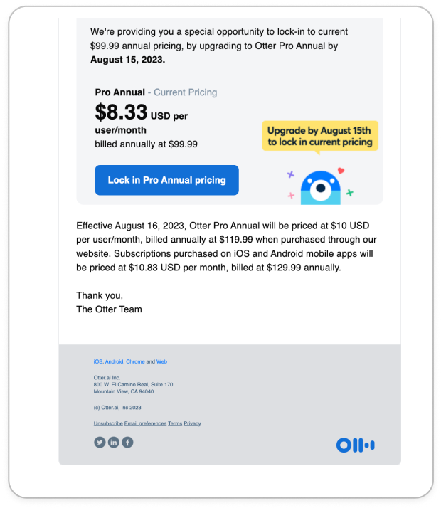
Subject: Final reminder: Details on upcoming price increases.
This is an oldie from 2023. First impressions: it is long.
So long that I screenshotted in two parts:
What works:
What doesn’t:
Because of the overload, on the first read I don’t instantly ‘get’ it. After a re-read, I’m clear on the changes. Who knows, maybe that’s a strategy. 🤷♀️ But overall, Otter.ai comes across like they care, and like they’re working hard. If Otter risks overwhelming with too much, Notion lands closer to the other extreme: clean, clear, but missing the bigger story behind the change. 3) Notion
Subject: important changes coming to your Plus plan
Now, this isn’t a price change email, but a ‘we’re removing features from your plan’ email. It’s a fresh one from May this year.
Aaand here’s the rest:
What’s great:
What’s missing:
Overall, a great example (if a little long). 4) MobbinMobbin shows what happens when you lean into transparency and a founder’s voice. It’s more personal, but still not perfect.
Subject: Upcoming changes to Mobbin’s Pricing
Now this is a real price change email: a 25% increase.
And the sign off:
What’s great:
Room for improvement:
Aside from that, I like it. 5) AppleAnd then there’s Apple, which sits in its own category. Not exactly a price rise - but an interesting case of how legal and compliance-led comms can miss the chance to build trust.
Subject: Upcoming Currency Change in Bulgaria
The merits:
The holes:
Overall, it works as a legal communication, but misses the chance to build it’s brand as a development partner and platform. B2C/Consumer Price change emails6) WeTransferWhat’s funny, is I didn’t realise I had a WeTransfer account before I saw this email mid last year 👀
Another long one…
What’s good:
What’s lacking: I feel like there’s a so many ways this could have been delivered that are more exciting than the current execution. It focuses on the transition and day that it happens versus the fact that I can:
Those benefits are buried in the table instead of being highlighted up front. Missed opportunity here. Tide, by contrast, keeps it ultra-simple. 7) TideFirst up, the subject line is clear and transparent:
Subject: We’re updating how we charge transfer fees
This isn’t a price change or feature change email, it’s just a process-change email.
Pros:
What’s lacking: I think this example is pretty spot on. If I had to say one thing, it’s that it doesn’t really click what the change is without a visual. A nice GIF could have helped communicate the change here. 8) MediumAnother edge case, not about charging customers, but about changing how they pay writers. Interesting to see how they frame remuneration shifts.
Subject: Partner Program Update: Starting October 1, we’re rewarding external traffic
This one is interesting, as it’s a payment and renumeration change email. But…without the celebration that you’d expect goes with it
Hits:
Misses:
It’s one of the more transparent and explanatory emails compared to Loom/Otter/Notion. But the sheer length and mission-heavy framing could frustrate writers who mainly want clarity on money in, money out. 9) UrbanNow, this is a niche example many of you won’t have heard about, but it’s one of my favourites. It’s been in my folder for so long I can’t find the subject or the date, however it’s the content I really like.
What’s good:
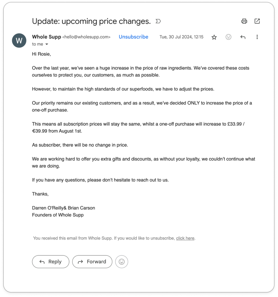
What could be better: 10) WholeSuppNow here’s my favourite email of them all. It’s from WholeSupp is a meal shake brand, as an eco-friendly competitor to Huel. WholeSupp takes the opposite approach to Urban: minimal design, founder-written plain text. It’s rough around the edges, but feels waaay more human as a result.
Subject: Update: upcoming price changes
What I love:
Improvements:
So, after almost 2000 words, what are the themes? 7 takeaways to bring to your next price changeThe best approach, of course, depends on your brand, your audience, and the type of change you're making. But across these 10 examples, some patterns repeat the things that build trust:
Curious to hear — how have your price changes gone? Thank you SO much for reading (all the way to the bottom, wow look at you go). See you next week, Rosie 🕺 |


Growth Dives
Each week I reverse engineer the products of leading tech companies. Get one annotated teardown every Friday.