Each week I reverse engineer the products of leading tech companies. Get one annotated teardown every Friday.
Growth Dives: When PLG Backfires
When PLG backfiresHow Typeform’s growth model tripped me up Download as PDF or read online. Big thanks to the Attio team for sponsoring this issue of Growth Dives! Attio is my favourite CRM tool ✨ If you want a sneak peak of how the tool works, you can check out my UX review of them here and you can steal my Figma template while you're at it 😈 Yesterday, I made a mistake. I sent a user research email to 15,000 people with a broken link. I’d tested the link minutes earlier and it worked. But by the time the email went out, it was dead 💀💀💀 What happened?Typeform’s PLG flow happened - and it happened in two parts:
Chaos, I know. Nevertheless, interesting in terms of a UX analysis. Let’s start at the beginning, because this is more than a broken link - it starts with how you set up pricing plans to enable team growth. Problem 1) The Structural IssueAt Fyxer, we have a Business account for Typeform.
However, Typeform’s self-serve plans cap at 5 seats.
Basic: 1 seat
Plus: 3 seats
Business: 5 seats
What that means is that once you hit 5, the “Invite teammate” button just vanishes 🫠 Adding more requires going through sales and upgrading to Enterprise. After the button disappears, you’re into an endless flow of contact forms, arranging a call, and getting access for that one extra person. There’s essentially a big brick wall between the Business and Enterprise tiers.
The only way I can describe how it felt is like when someone is running and they run into a clothes line. Or when there’s a car chase and someone throws nails under the wheels. We were stopped in our tracks.
Many SaaS tools cap their small-team or “business” tier - but most don’t stop you completely:
So actually, Typeform feels like they’ve built their brick wall relatively high in the funnel - in other words, it’s easy to get blocked. This is what happens when sales targets and PLG targets pull in opposite directions. Instead of using enterprise plans to unlock bigger deals, Typeform has drawn the line too early and cut off what could still be part of PLG. The result is friction right at the moment adoption should be compounding. Instead of scaling with us, the product blocked us. Now, on to another problem, but this time at the start of the self-serve journey, not the end. Problem 2) The UX TrapSince I was blocked from our team plan, I whipped up a new Typeform account.
I flew through onboarding at the speed of light.
The time-to-magic-moment was FAST. It was a nice touch that I completed a survey as part of the onboarding flow, quite cool. Anyway, I got in, and I made a survey.
Bish bash bosh - I was on a roll. Popped it into an email, tested the link and the full survey flow.
Even added my Calendly at the end as a follow-up. Tested it 2–3 times more, then hit send. Great, right? The epitome of Product-Led Growth. Wrong. Minutes after my email went out to 15,000 people, I got an email from Typeform saying I’d hit my limit.
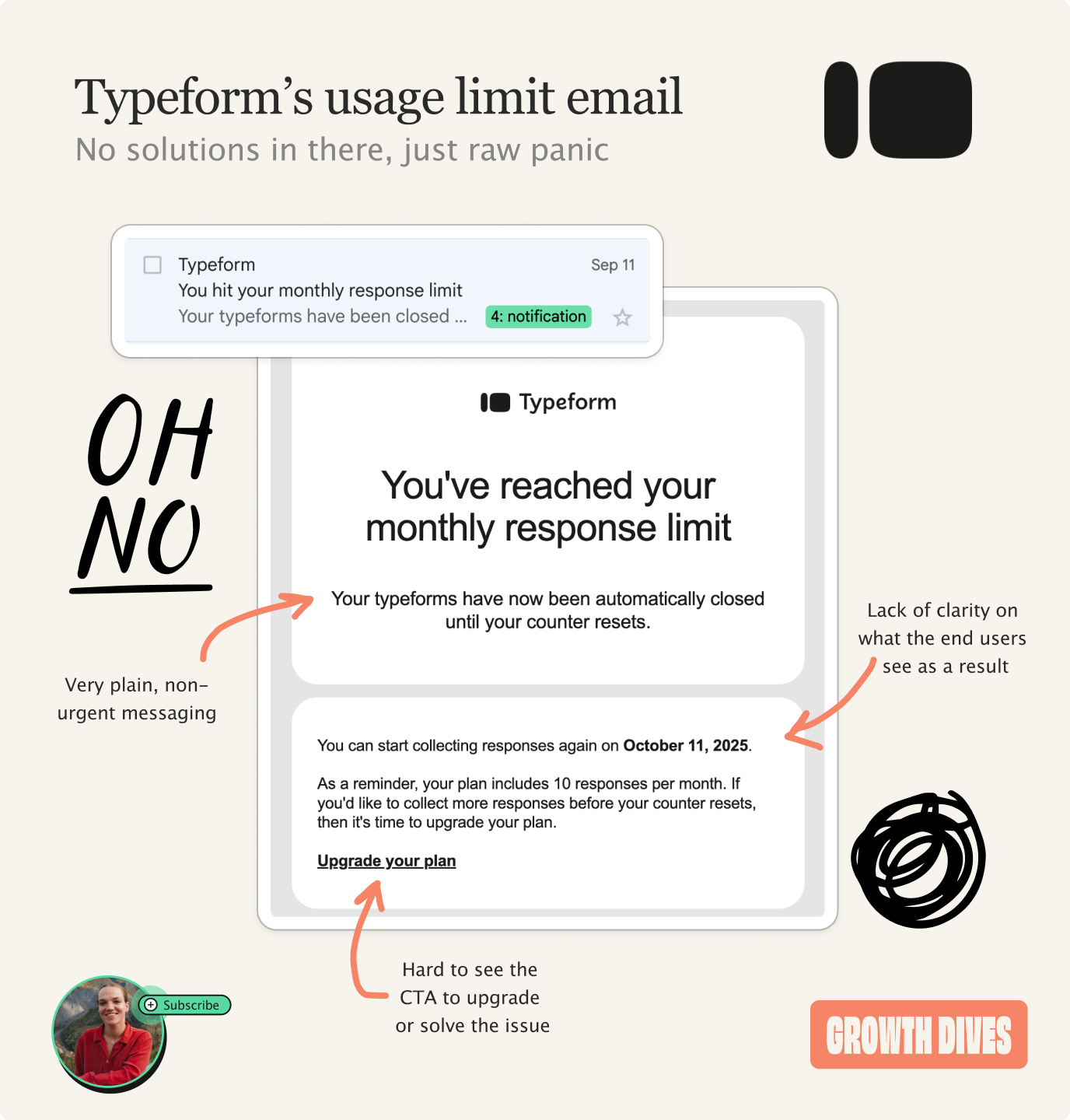
The email was calm, but I was not.
My live campaign was suddenly suspended.
What users saw when clicking the link: nothing but a smiley.
What would have worked better here:
What actually happened:
As you can imagine, I did not screenshot a single step of this. So alas, just bullet lists for you here today 🎻 But the outcome? About 2–5 minutes of downtime on the survey, likely affecting ~30 people as a rough estimate. Crisis averted. But how do I feel about Typeform right now? Not great. Problem 3) The Design IssueFunnily enough, thinking back, I did see a subtle green banner as I was working in Typeform - if you look close enough, you can see it.
There were warning signs.
What this shows is that Typeform did try to communicate the limit, but the design failed to create the right mental model. At the time, the banners didn’t land. They read as light, promotional nudges - not hard limits that would suspend a live form. This is a UX writing and UI mismatch:
In my speed, I interpreted them as marketing upsells, not as an operational risk. The issue wasn’t that Typeform didn’t warn me. It’s that the design failed to make the warning feel consequential. What would have landed better, and created behavioural change:
Call me an idiot for not reading banners, but people rarely do. As product folks and designers, we need to be designing for the behaviours that are present. Basically, don’t design for a perfect world but a realistic one, where people skip happy green banners. The takeaway?Notice when PLG moves too fast for its own goodNone of this is about one broken link. It’s about how product decisions that drive growth at the top of the funnel can quietly erode reliability and trust. Typeform has nailed speed to value. It’s frictionless, beautiful, sleek - an all-around joy to get started with. But past a certain point, the same design starts to work against you:
At one end of the scale, it’s too easy to proceed. Whereas bizarrely, at the other end of the scale, it’s too hard to progress:
This is what happens when PLG and sales targets get misaligned. Instead of using enterprise plans to enable bigger deals, the product cuts people off while they’re still in their adoption curve. If PLG is about reducing friction, it has to reduce friction all the way through the journey. But not so much that you let users go wild and break things in the process. What a paradox hey. So tell me, honestly, was I just being silly? Thanks Again to Attio 🫶 Thank you SO much for reading (all the way to the bottom, wow look at you go). See you next week, Rosie 🕺 |


Growth Dives
Each week I reverse engineer the products of leading tech companies. Get one annotated teardown every Friday.