Each week I reverse engineer the products of leading tech companies. Get one annotated teardown every Friday.
Growth Dives: How Duolingo drives subscription conversion
How Duolingo drives subscription conversionA review of Duo’s post-purchase UX that got them to 10M subs Read online here or download as PDF
With as many as a third of new subscribers cancelling within just a few days, converting users is only half the battle. I recently revisited Duolingo (a product that’s grown fast despite being well-established) and what stood out wasn’t just how they drive subscriptions, but how deliberately they reinforce the value after you’ve signed up. I’d abandoned my French on Duo years ago (and since swapped to 1-1 lessons, naturellement), but curiosity pulled me back in after hearing how the edtech had grown 4.5x over four years up to 2023 and recently passed 10 million paid subscribers. I expected to focus on their conversion tactics, but it was their post-purchase experience that really caught my attention. Duolingo’s post-purchase UXI bought my Duo subscription from the small card in the shop tab. There was a surprising number of screens before I started my 2-week trial, with some nice touches:
Once I’d finished the OS payment with Face ID, what happened next really got me: Duo took on a Pokemon-esque evolution and shot off into hyperspace on my screen.
I love seeing the premium branding of SUPER transform Duo on my screen: he upgraded like a Pikachu levelling up, then shot off through space like:
I wasn’t expecting this over-the-top animation. But loved it. While it was a bit silly, it was memorable, made me laugh and I genuinely smiled when I watched it. Like I was privvy to a special Duo show. The levelling-up animation was then followed by a very extensive explanation of what you get with SUPER Duo. I had to swipe through a 5-step carousel of key benefits of my SUPER subscription:
Whilst it hammered home the five key parts on my sub, by the end I thought: Let me get back into the app already... The last part of the carousel was interactive, prompting me to turn on my custom app icon - something that makes your push notifications really pop as we’ll see in a sec. Back in the app: what’s changed?Turns out, not much. After the intense purchase UX, I was expecting a similar experience back in the main app. But it was surprisingly subtle. In the top navigation on the right, I have a running Duo icon in the SUPER colour gradient. Tapping on the icon launches a bottom sheet covering my subscription features and an upsell onto the family plan (I assume family plan users have higher lifetime value due to the higher price point and potentially more accountability to learn with peers, hence why they’re pushing it).
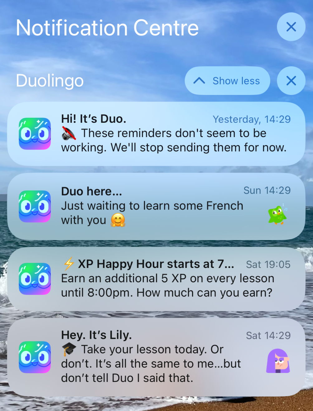
I do like having the ability to turn my paid features on and off in one place — is like a one-stop-shop for my subscription, reminding me of the value. Yet it does feel light as experience, especially after the over-the-top purchase flow. Scanning quickly through my other tabs on the bottom nav, they are near identical to before my trial. I felt deflated. It was an anti-climax. Like when the final season of your favourite show lets you down ** cough cough Game of Thrones cough cough**. It was a short sharp honeymoon phase with Duo I’m afraid. Outside the app: subscription CRMBecause I turned on my custom app icon, with each push I was reminded of my SUPER subscription by my cool new logo. Its a small change, but exposing users to small reminders of why they’re special helps communicate subscription value.
App icons are valuable real estate. I’ve seen changing just the colour of an app store icon result in 40%+ increase in app store conversion rate. Icons are not to be sniffed at. Aside from the one push I received around my trial ending, I did feel like my pushes were the same as I would have received on the freemium experience.
This was a bit of a missed opportunity in my view. I could tell that these weren’t aimed at me as a subscriber. There’s a chance here to cut through Duo’s normal pushes like Tinder does to pre-churn users. I did however receive a bespoke email aimed at SUPER subscribers with a snazzy new template. Welcome to Super Duolingo!
What’s interesting here is the free monthly streak repair. That is something I’d be interested in (loosing a streak is one of the worst feelings in the world —leading to a bad mix of guilt and demoralisation according to UX writer Ben Davies-Romano). Duo improved the % of DAUs with a streak of 7 days or longer by 3X in recent years, now sitting at almost 50% of DAU. I imagine the streak freeze features contributes to this in part. Why didn’t streak freeze get pulled up in the 10+ SUPER screens I swiped through in my purchase journey? Not sure, but I would have liked to see it there over the weaker screens like ‘prove your proficiency’. In sum: love the Pokemon vibe, a bit more could be done with CRMHere’s the key points thats stood out for me in Duolingo’s subscription flow What went well
Areas for further testing
In the end though, after flying through space with Duo, I cancelled by subscription shortly after. I’m someone who needs accountability to learn outside of work (not just from an Owl). I’m sorry Duo, till the next time… I would love to know others’ experience: what has driven subscription conversion for you? What other apps do purchase UX well? See you next week, Rosie 🕺 |


Growth Dives
Each week I reverse engineer the products of leading tech companies. Get one annotated teardown every Friday.