Each week I reverse engineer the products of leading tech companies. Get one annotated teardown every Friday.
Growth Dives: How LinkedIn passed $2bn in subscription revenue
How LinkedIn passed $2bn in subscription revenueAnd they're still missing out on their potential View online or download as PDF.
This year, LinkedIn hit a record $2 billion in Premium subscriptions revenue — a 50% increase in just two years. Not only that, but the free platform is performing strong, with 1 billion users across 200 countries and an increasing engagement year on year - comments alone are up 37%. Why this is interesting: for many companies, mature = plateaued. But LinkedIn’s growth suggests otherwise. Once you’ve hit a ceiling as a mature company, growing again is hard. Typically, you need to one of the following:
So, the question is: how did LinkedIn manage to grow again - without dramatically changing who it serves? Their official line: features - especially AI. 40% of Premium subscribers use AI-powered tools like profile customisation, while a third use AI for job searches. LinkedIn CEO Ryan Roslansky said:
We’re focused on designing and continuing to iterate on a model that is value-orientated to meet the needs of our subscribers — those who want to accelerate their career or grow their business. We bet big on our investment in AI tools to help our subscribers accelerate how they connect to opportunity, and it’s paying off. — TechCrunch It’s not the double-digit monthly growth like early-stage startups, but the sheer volume and growth are impressive for a mature. According to TechCrunch, the single-digit growth is set to continue: LinkedIn said that it expected future revenue to grow in the “low-to-mid-single digits”. I’ve been digging into what actually moved the needle for LinkedIn (I think), beyond the AI hype. Because let’s be honest: when do new features alone really drive step-change growth? What I found is a coordinated set of tactics across paywall testing, pre-paywall screens, entry-point strategy, and positioning. So, what’s really behind the $2bn milestone? Let’s start with one of the clearest shifts: 1) More entry points into the subscriptionI see way more prompts to subscribe than I used to.
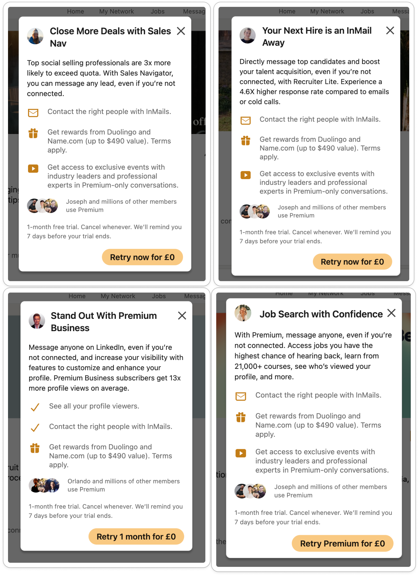
From profile, there’s:
Adding friction between the CTA and paywall is sometimes a good idea, particularly when users feel they need to ‘know a bit more before committing.’ I’ve seen AB tests with more intermediary screens between CTA and paywall do better than low-context flows (that direct straight to paywall). For LinkedIn, these intermediary screens vary drastically from the same CTA, and I can’t quite tell whether they:
The three things that seem to change are the header, subheader, and feature list.
Personally, I find these screens too busy. My first test would be to reduce copy. Some recent tests I ran with a client demonstrated that reducing copy on paywall-related screens increases conversion. It reduces the cognitive load and information overload that a wall of text gives 🧠 On a premium profile, I can send a free message, but I’m asked to pay if I want to ‘write with AI.’
What’s key here is that there are multiple entry points that push me towards a paid subscription. The key challenge for product managers, designers and engineers is to strike a balance between having enough CTAs to drive conversion without making the users want to rip their hair out. Realistically, you can add many more entry points if they’re contextual and useful. Telling me the value of Premium in a load of copy doesn’t work. As a user, I don’t read the long copy on paywall pages. Telling is the least powerful form of educating. Showing is better, and doing is best. With monetisation, what’s most helpful in educating me about features is the brick wall I get to when I try to use the features themselves, like:
In these junctures, I get a ‘aha’ lightbulb moment about what the value of paid is: unlimited stalking. Just kidding, more like no barriers to growing your network. 2) Pre-Paywall UX flowIf I actually click on a CTA, I’m taken through a four-part UX flow that asks me questions about my goals on LinkedIn.
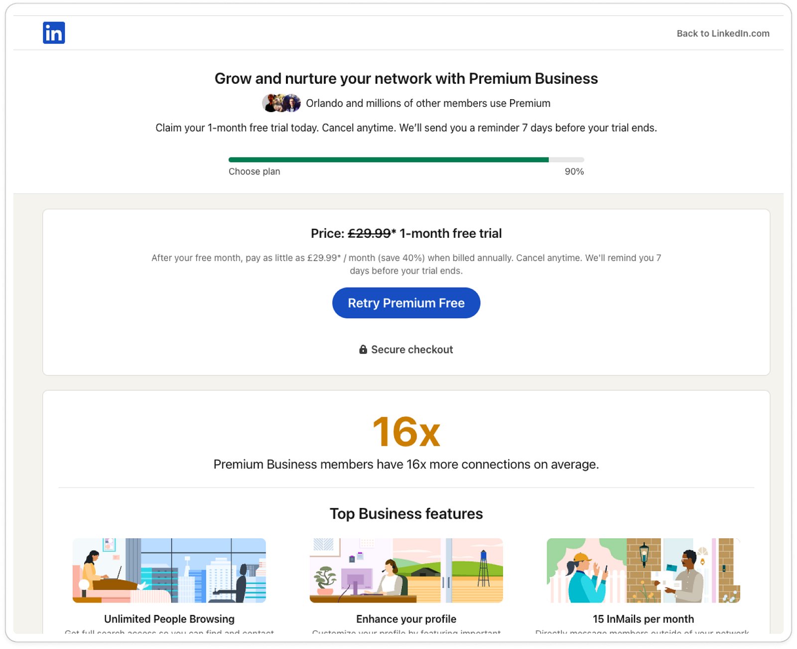
There’s a persistent header: The average career is 42 years. Drive sales and boost your success with Sales Navigator. With some avatars of my current connections next to the phrase: Orlando and millions of other members use premium And lastly, some copy to reduce my anxieties around payment: Claim your 1-month free trial today. Cancel anytime. We’ll send you a reminder 7 days before your trial ends. There’s also a persistent customer support module ‘Questions? Chat with a specialist’
Then I see a progress bar, which fills with green as I progress through the questions.
The three questions I get are:
Notice how each question includes ‘We’ll recommend the right plan for you,’ which is the ‘why’ behind the questioning. When I’m through, I do see a recommended plan. However, for some reason I don’t fully trust it.
Why? I’m told I’ll be recommended the right plan. However, I don’t see any other plans. I’m not convinced that there are any. More transparency here would help, and I’d (potentially) have converted if it said:
Or, even better ‘creator tools’. What really would have converted me is:
When you do personalisation, it’s key to really understand the target audience and make your copy convincing. If I tap on ‘retry premium free’ I get through to their paywall.
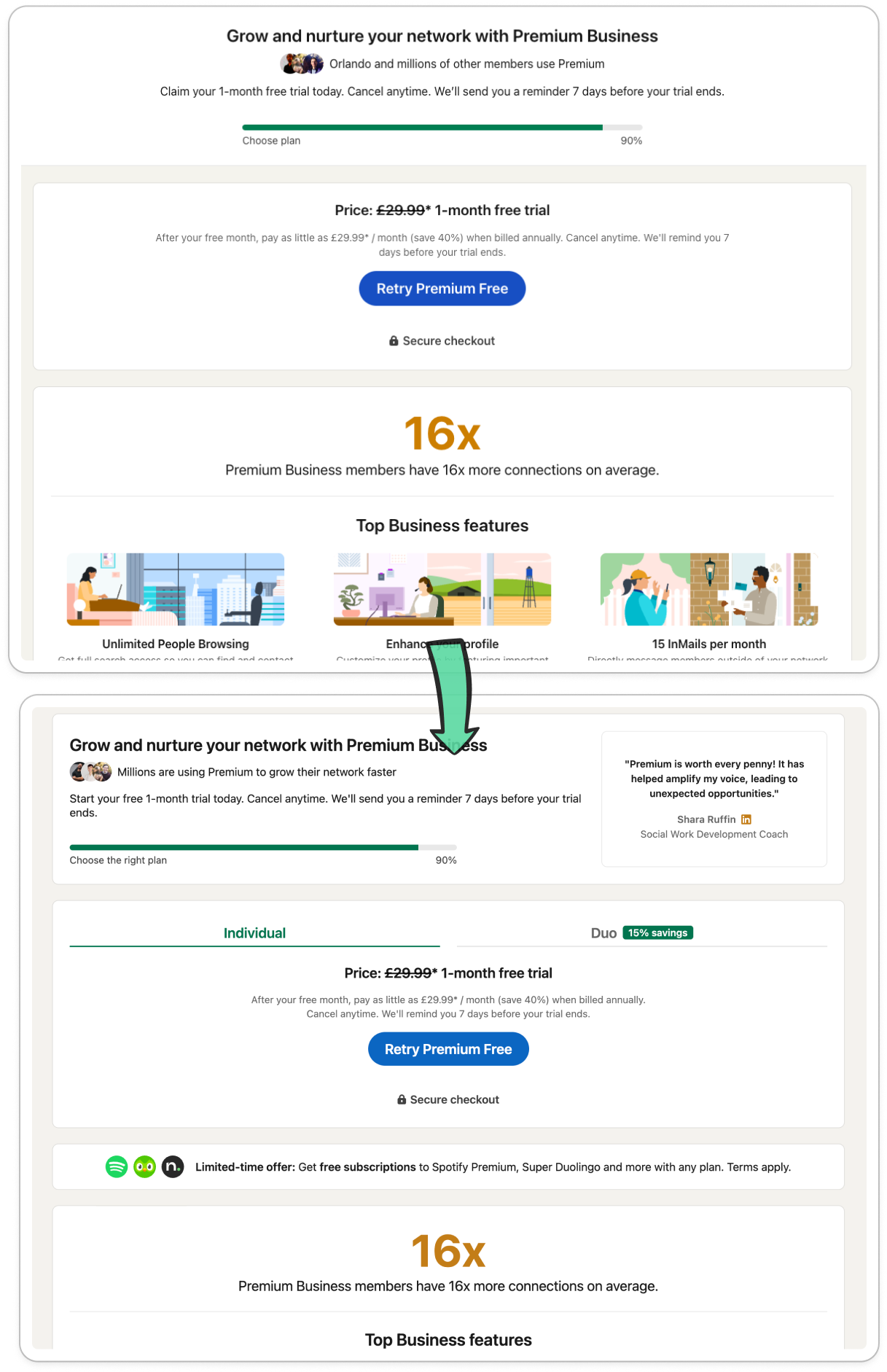
And this reminds me why I don’t have premium: for nearly £50 a month, you’d need to give me ChatGPT-level value, a content scheduling calendar and more for that to be worth it. $2bn in subscription revenue across 1bn users = $2 ARPU (average revenue per user). That’s high for a freemium model, suggesting either strong LTV (lifetime value) or high conversion. My money’s on the latter, given the price point of nearly £50/month. Next up: some interesting AB tests. 3) AB testing of UI and positioningNow, the jury is out whether these are actually performing against each other — or whether they’re just different iterations. But what’s clear is that there are some key changes from March 2025 ‘til now.
First off, I can spot three big differences in the header:
In the question UI, we can spot subtler tweaks:
Can you spot the change to my profile pic avatar too? I am now ✨ gold ✨ My pic is circled in LinkedIn’s premium gold colour and the logo sits right of my face. A nod to: This is what you could have.. Lastly, there are two big changes on the pre-paywall page:
So, what’s the verdict? Do the new changes make me want to purchase? No. What’s missingHere’s the three BIG things that’s missing for me. As a user, I have specific needs. None of which are covered by the features in the paid plan. I want tools that help me:
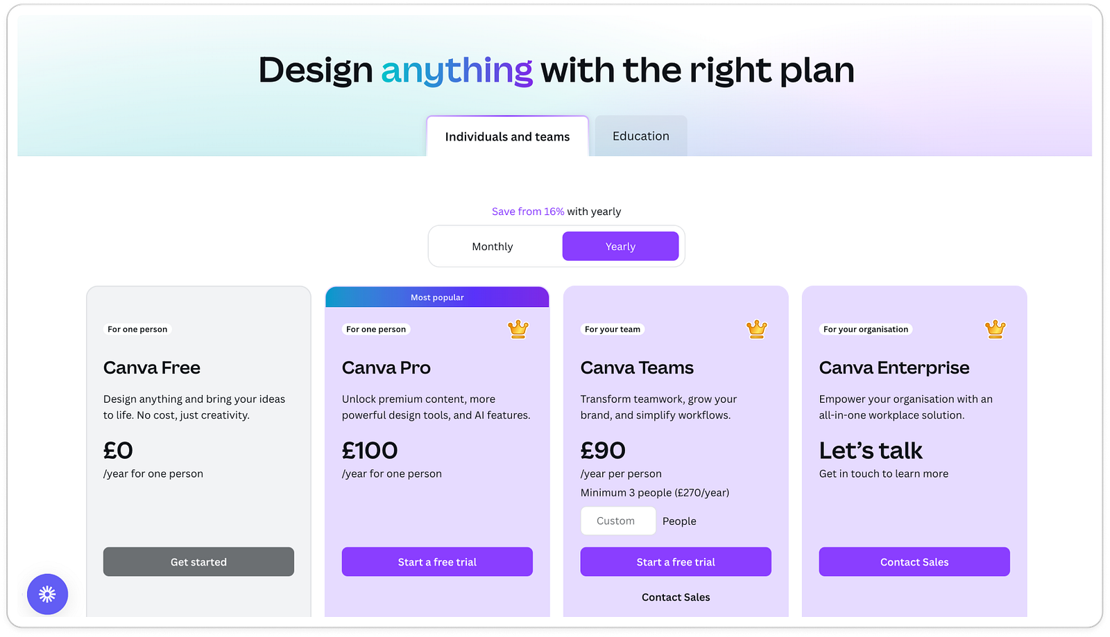
What’s really lacking here is a more mature monetisation strategy where the tiers link themselves to a persona. Paywall positioning is key. Take Canva, whose tiers are labelled ‘for one person’ or ‘for your team.’
LinkedIn’s premium messaging seems to be wildly confused between targeting recruiters, sales people and creators. Which means that the messaging gets diluted for everyone. Perhaps creators like me are not the target audience that's perceived to be high value. Still, the paywall could go a long way in terms of clarity, copy and more to boost conversion. So, what are the big lessons?Well, to get to $2bn subscription revenue it helps to have 1 billion users. But that’s not so helpful. So, what’s worth taking from this if you’re building or monetising a product? 💡 5 takeaways for product and growth teams
Paradoxically, the big challenge for LinkedIn is the size of their audience; it’s hard to cater for so many different use cases. I’d be curious to see how positioning for different personas could work to improve conversion, as well as a more slick UX experience of personalisation (something more convincing). My top tests for LinkedIn would be:
Your turn: What do you think LinkedIn’s missing? Or what would you test? Join in the conversation on LinkedIn here. Thank you SO much for reading. Any feedback? Shoot me a message. See you next week, Rosie 🕺 |


Growth Dives
Each week I reverse engineer the products of leading tech companies. Get one annotated teardown every Friday.