Each week I reverse engineer the products of leading tech companies. Get one annotated teardown every Friday.
Growth Dives: How Runna turned the London Marathon into a content loop
How Runna turned the London Marathon into a content loopWhat this clever wrap-up reveals about creating shareable product moments This is the only deep dive I’ve ever done without testing the product, which made it all the more interesting to see things from the outside 🪟 Read online here or download as PDF here.
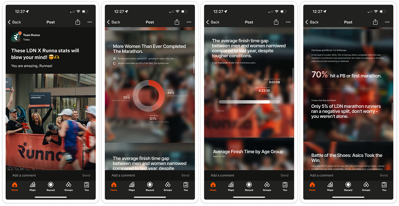
Last Sunday, I stood near my house watching the London Marathon go past — cheering on a lobster, a slinky and someone dressed as Big Ben. Later, while checking out finish times on Strava, I spotted a post titled: These LDN x Runna stats will blow your mind! 🤯 🫶
Curious, I clicked. What I found was a smart, shareable recap of the 2025 marathon from Runna — the running training app that’s just been acquired by Strava — pulling out stats like:
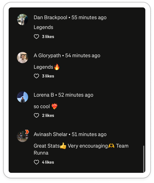
With over 500 likes on Strava and tons of comments, the graphs hit home for a lot of users (both old and new).
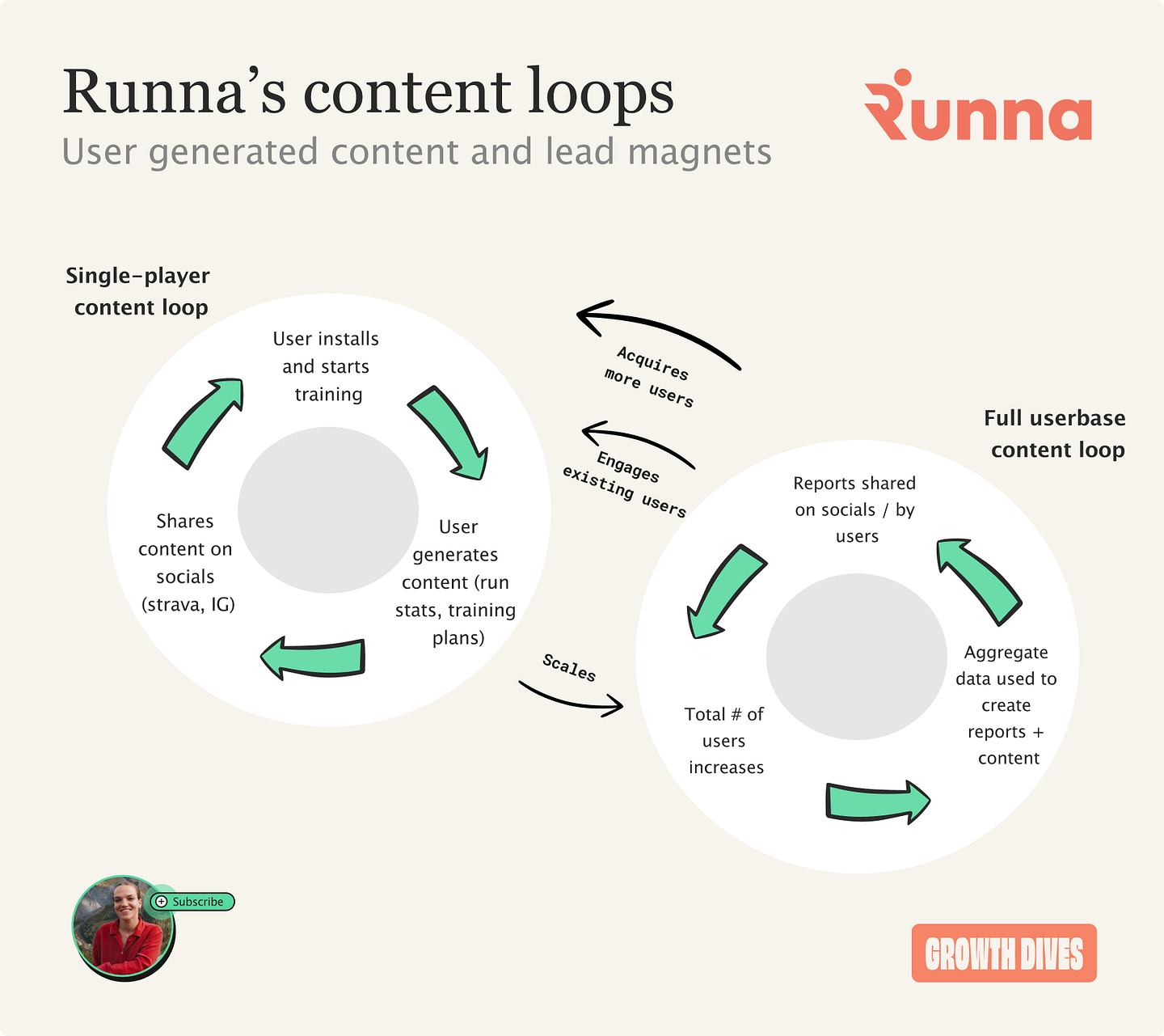
That’s when I realised: this is a mini content loop. And a veeeeery interesting one at that. Why is this example so interesting?Well, two reasons:
What’s more, I find it frustrating that much of the growth literature uses common examples that are hard to replicate in reality. For instance:
Fundamentally, most products aren’t built like that. Especially single-player apps like Calm, Headspace, and Nike Run Club. They’re not viral. They’re not indexable. Many rely on paid growth (Meta and TikTok ads) to scale. Which is why Runna’s recap stood out: it is an actionable example of product and content-led growth from an app whose business model doesn’t always lend itself to PLG. Examples like this aren’t mind-blowing, but they’re often quite actionable and tactical. As we’ll see, Runna managed to: ✅ Create a shareable moment ✅ With unique, original, and useful content ✅ Created from its feature usage ✅ To attract new users and engage older ones And — as we’ll see in more detail later — what’s clever is that Runna has two loops fuelling each other:
The individual loop feeds the aggregate one. More users = more training data = richer aggregate insights. We’ll take a closer look at the timing, content and UI to work out how you can apply this sort of thinking too. First up: timing. 1) Lesson 1: How to time your momentRunna’s marathon report is similar to Spotify Wrapped in the idea — but arguably better in some ways. Why? Well it doesn’t fight for attention in the end-of-year recaps. Now every app under the sun does a ‘wrapped’ (Monzo, Loom, Strava, Duolingo) meaning high competition, some weird ones and a general diluting of the tactic overall. Runna, however, picked its own moment: right after the London Marathon. At this time, emotions are high, there’s lots of FOMO (if you didn’t get a ballot spot), and a lot of motivation to ‘run it next year.’ This means users are primed to start a new habit, and this timing is a bit fresher than an end-of-year timing. Remember: wraps don’t just have to land at the end of the year. Pick the moment your users are going to be primed. What’s cool about choosing this timing is that it’s also repeatable; there are multiple marathon moments across the world throughout the year. Bingo. Next, it’s not only about when you do it, but what’s in it. 2) Create something new and uniqueWhen I opened the post, I learned a few things. The stats piqued my interest, random titbits like:
This is using aggregated data as a Data Network Effect.
A data network effect is when a product’s value grows as a result of more usage via the accretion of data. — nFx Data is not inherently valuable. But you have to make it valuable. You have to be creative in how you use it, but also show it in a way that shows your product’s value. In Runna's marathon report, the value proposition is hammered home with: Runna Runners Smashed Their Training
Runna runners crossed the finish line over 4 minutes quicker than the average London runner
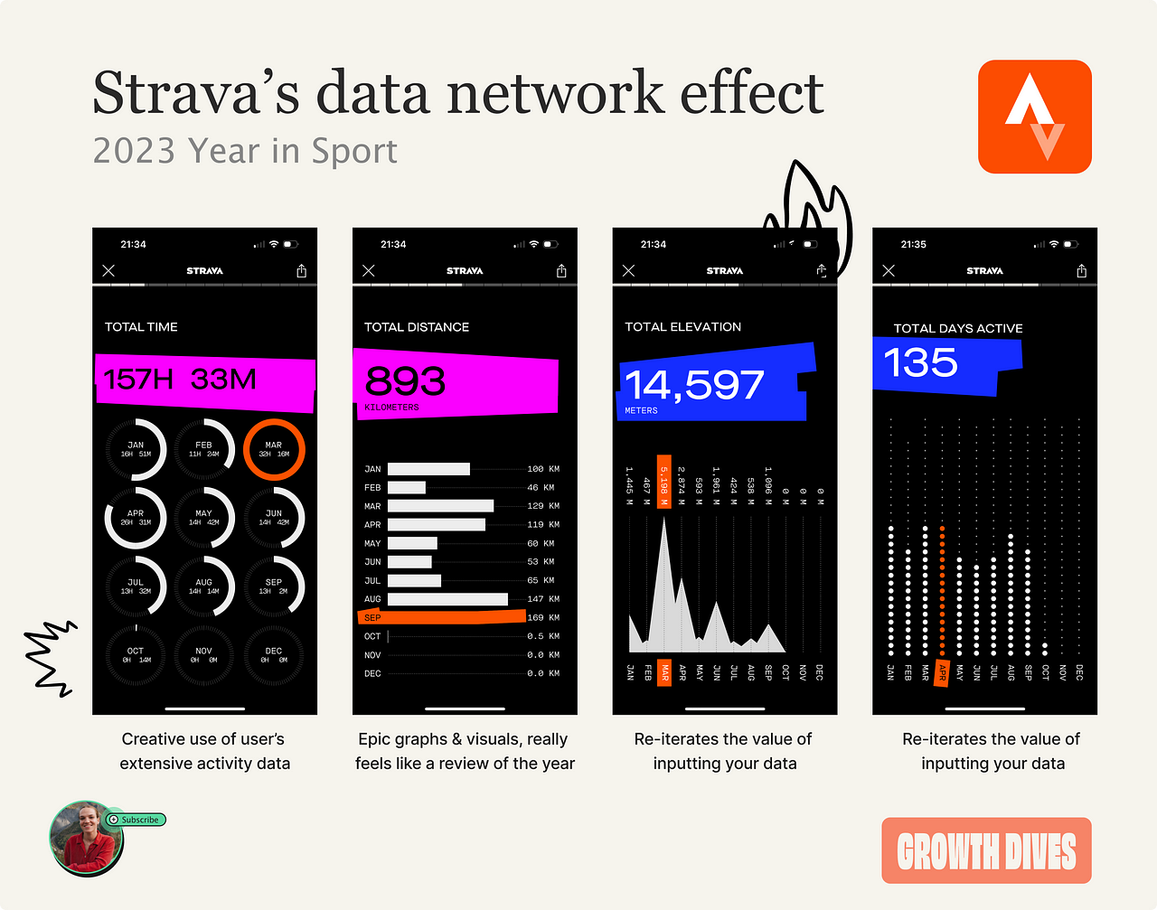
Clearly communicating the value of the product through their user data, without having a sale-y 'download now'. The only downside of this execution is the accessibility: some of the copy is super hard to see without a zoom. The blurred image background also makes my eyes hurt and the fine lines hard to see. With these, it is important to make designs as attractive AND legible as possible, like Strava’s 2023 Year in Sport: bold colours, big numbers, cool graphics.
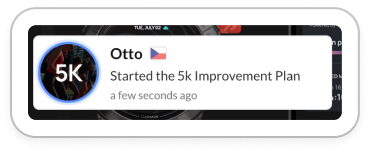
As well as this content loop, Runna even has a pop-up on their web homepage when a new user joins a training plan. Every. Single. Time.
This creates a nice nudge for users to take action with the social proof that others are doing it too.
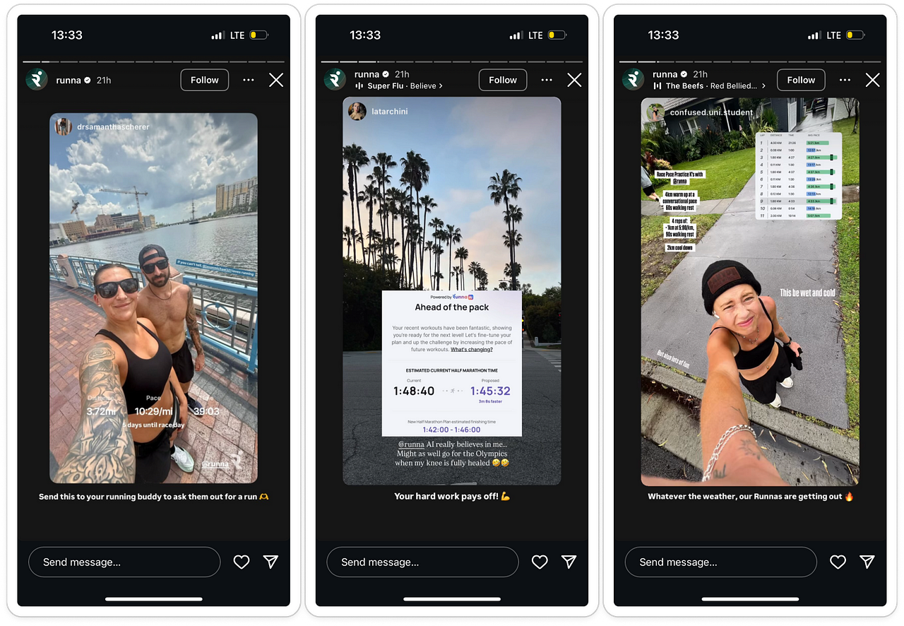
Pretty neat. 3) Make your features shareableWhilst the UI of the London Marathon report scores a low 3/10 for legibility, the rest of the app features do really well in how great they look when shared. I’ve not even seen what they look like in the app. But I’ve seen them all over my social channels without actually following Runna. Instead, it's friends, influencers and others sharing Runna features. Going on Instagram, I see a range of features overlaid onto user-generated content (UGC):
When researching sharing before, I’ve found there’s often friction to share stats caused by user fears, anxieties and hesitations For instance with running, there are anxieties like:
So, how do you encourage people to share? Three things stand out about how Runna’s features are designed:
To tackle fear of sharing, UI focuses on progress, not performance — and abstracts away details while still telling a compelling story. The result is that sharing feels less risky. And therefore it's more likely to happen. So, what can we take away?The lesson here isn’t “go make a Wrapped”. It’s to find your own moment, and make it shareable. Even if your product is a single-player tool, there are still opportunities to spin a content loop. As we’ve seen from the Runna example, you can create your own assets that are share-worthy and engineer them to be as friction-free as possible. What makes it tick is a combination of good timing, smart design choices, and understanding what makes people feel proud to talk about their progress. As more single-player products look for low-cost growth channels, organic content loops like this are becoming an advantage. A few questions for you to brainstorm:
Let me know what it sparks ⚡️ Seen any other smart “non-Wrapped” wrap-ups? I’d love to collect a few more examples. Fin Funny story: I had to re-write this one as the first draft I did hungover and it was terrible :') Curious to know if you could tell it had less structure than usual? More of a winding flow. Anyhow, see you next week! Rosie 🕺 🕺 🕺 🕺 🕺 🕺 |


Growth Dives
Each week I reverse engineer the products of leading tech companies. Get one annotated teardown every Friday.