Each week I reverse engineer the products of leading tech companies. Get one annotated teardown every Friday.
Growth Dives: the underdog app no one is talking about
The 500-year-old underdog no one is talking aboutWhat Royal Mail teaches us about using illustrations and empathy-first design Join in the conversation on LinkedIn and read online here
Last year, I forgot to send my gran a birthday present. I felt crap. Partly, I didn’t realise how fast April flew by. But mostly, I dreaded the faff of posting a parcel. I once queued so long to send one that the line went round the block.
As a result, parcels pile up in my house. I miss return deadlines. I miss birthdays. Until someone said to me recently, “You know there’s an app for that right?” To be honest, my expectations were low. Low because this is one of the many UK services that have been privatised and postal services have a bad reputation (for stunts like this). But how wrong I was. This time round sending my grandmother a birthday present never felt so easy. I didn’t leave the house. I didn’t hunt for a printer cable. I didn’t even run out of ink and buy the wrong cartridge. I came away surprisingly relaxed and pretty damn proud of myself for being a good granddaughter. This is a case study of how Royal Mail quietly built one of the UK’s top-rated apps that barely anyone talks about. We’ll walk through the journey of sending a parcel, from the App Store to onboarding to the magic moment. We’ll see how smart copy, illustrations and empathy-first design cover for some serious quirks and bugs. Ultimately, we’ll find out how this app gets away with more than others. Before we get into the app itself, it’s worth asking: why would a 500-year-old company even build an app? (Feel free to skip this context section if you don’t like economics or history.) Why would a 500-year-old company build an app?Started by a King in 1516, Royal Mail is the third oldest company in the UK and serves thirty million households every week.
However, the market is changing
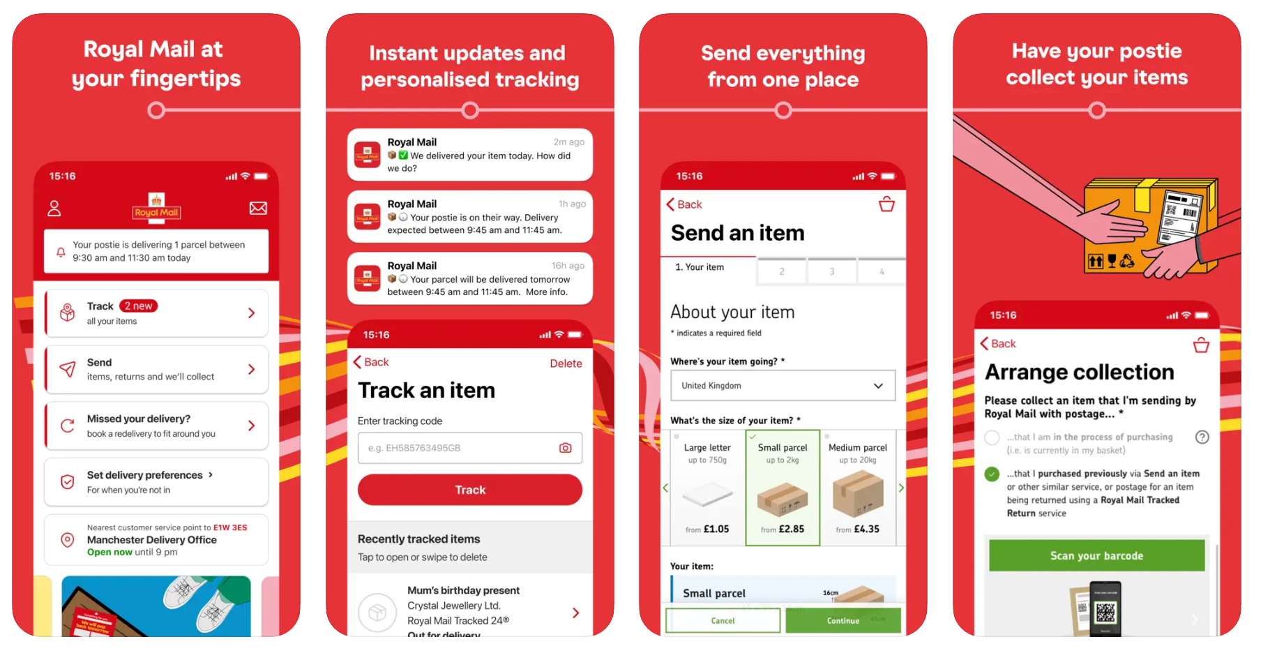
Less letters, more houses, more parcels. Which means fewer people need a post box — and far more need the post office. And with that demand comes friction: long queues, missed deliveries, packed counters. And thence, the Royal Mail app was born. Launched in 2016, it’s grown steadily — now with over 7 million users, a 4.6-star average from 329,000 App Store reviews, and a top three spot in lifestyle (right behind Pinterest). Not bad for a 500-year-old company — founded around the time lead was used in makeup, germs didn’t exist (yet), and the Earth had just been confirmed to orbit the sun. Back to the present day, let’s take a look at how the app works. 1. An App Store listing that needs workI land on the App Store listing, and at first glance, it’s missing some easy wins:
In App Store Optimisation (ASO), your logo, title and first screenshot are your storefront — the only things most people see before deciding to download. Moreover, screenshot one really matters as only 15% of users reach the second image, and just 6.5% make it to the fifth.
However, when zooming into the copy, you notice the
*UK slang for the person who collects the post
There’s great copy and imagery buried in here, it’s just too deep in the screenshots to be noticed. I hit download, feeling curious and still a bit sceptical. Then the onboarding began… 2. Onboarding: starts off well (until permission overload)I’m greeted by a red rainbow animation flowing in a wave underneath the logo from top left to bottom right.
First impressions matter. Customers typically take milliseconds to form a judgement. This is why the first few screens are crucial. Here, attractive UI creates the Aesthetic-Usability Effect 🧠 where users think the experience is better just because it looks nice.
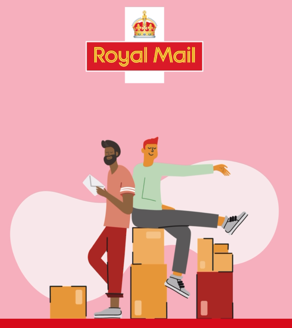
What this means is that you can build tolerance in users, so that they’re more compassionate to usability issues. We see this effect again on the welcome page with a nice illustration of two people with a pile of post. They look happy, relaxed, content.
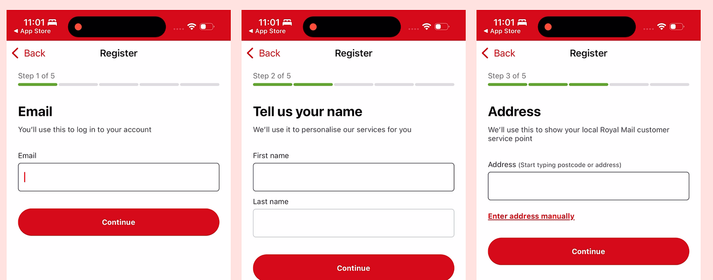
I read this as: “Get on top of your mail (literally) and feel good.” Perhaps it’s also about connection. Notice the two people are touching backs. There could be something to be said here for the connection you get when you post mail and parcels to your friends and family. I see a lot of apps use illustrations poorly. If you’re using illustrations, ask: are we reinforcing the brand? Showing something new? Evoking emotion? Adding extra demos? Using it for product marketing? This will help you to include illustrations that add value. After the welcome screen, I move through the registration flow. The UI here is slightly odd — it almost feels like a web app.
What’s more annoying is the sheer amount of permissions I’m bombarded with: terms, tracking, Face ID, notifications, cookies and more.
(Most) permissions are necessary, but it’s about where they are in the flow. They need to feel relevant or be positioned after a moment of motivation. It’s also about the execution. Which need to be pop-ups? Which can we use a screen for to feel less spammy? Which can be postponed until the next session? Take the marketing opt-in.
Here I need to re-read the sentence to understand what to select. I’d avoid these opt-outs like the plague. They erode trust fast. It’s much better to have a compelling opt-in, with an example of what comms they’ll get.
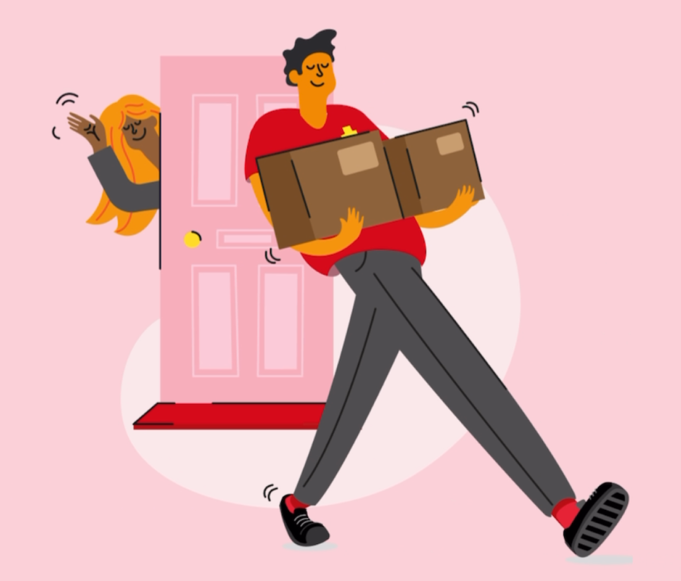
Empower people with transparency. Your email engagement rates will thank you. 3. Homepage: cosy copy and good energyOnce I finally emerge from the swamp of permissions and opt-ins, the app greets me with a surprisingly warm welcome carousel.
Again, it’s the details here that warm me right back up after the stress of onboarding:
Notice how each image does one of two things:
The copy is also excellent; it’s just hard to read. Phrases like:
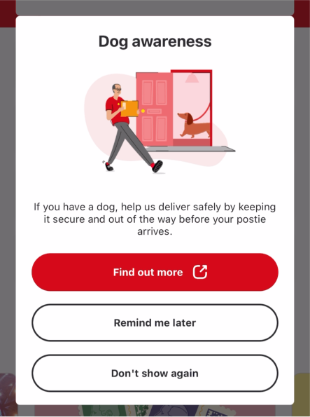
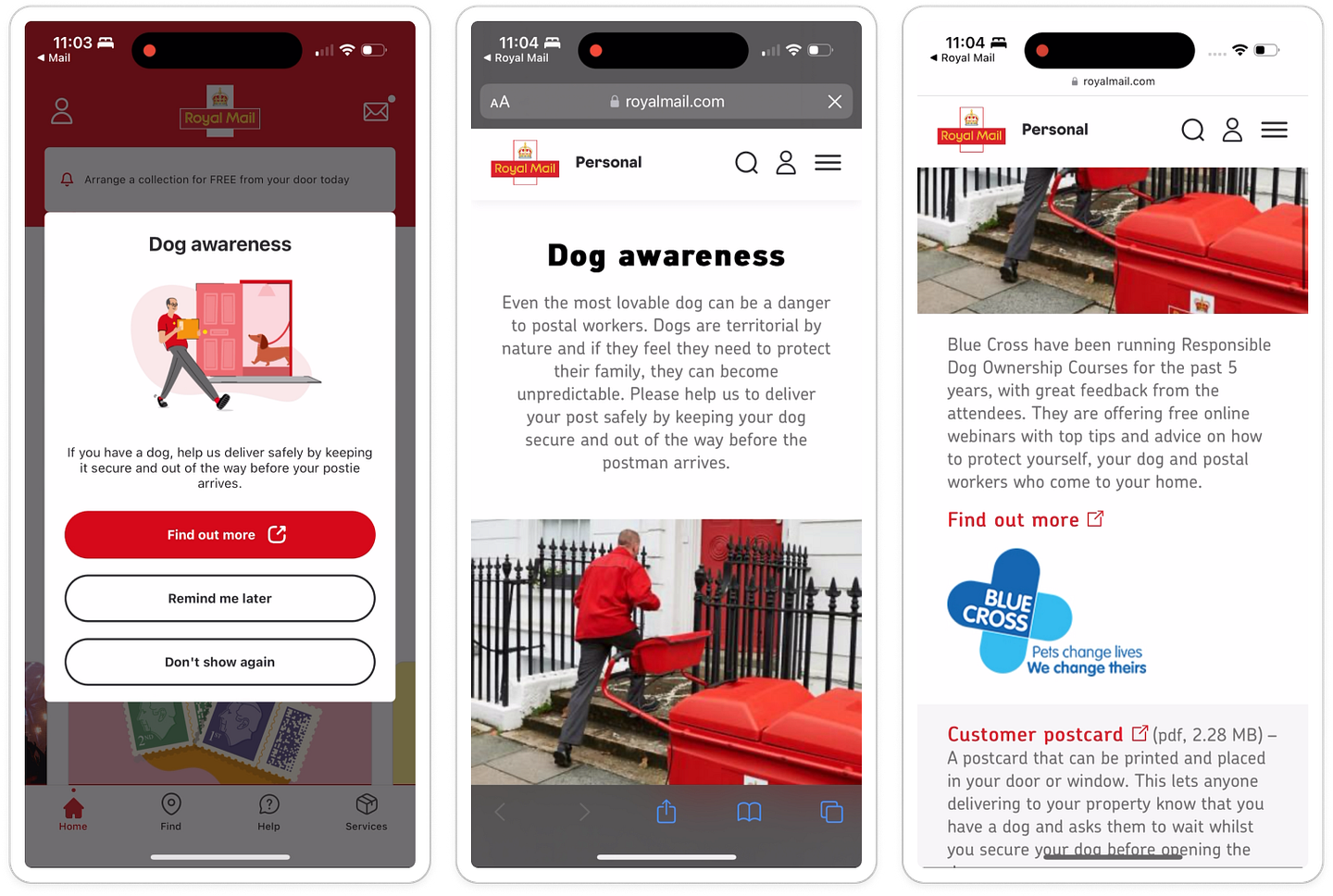
They feel conversational, empathetic and soft. Notice the use of the first-person plural pronoun ‘we’. It makes it feel like the collective group of posties across the UK is talking to me. Just as I think I’ve seen it all — from friendly posties to shed deliveries — I get a surprise pop-up I didn’t expect: dog awareness. 4. Dog alerts: a pet flow I didn’t expectJust after the carousel, I’m met with a pop-up titled: Dog awareness
As a dog-owner, I tap through — and land on a page explaining how even the most lovable pets can pose a risk, thanks to their territorial instincts.
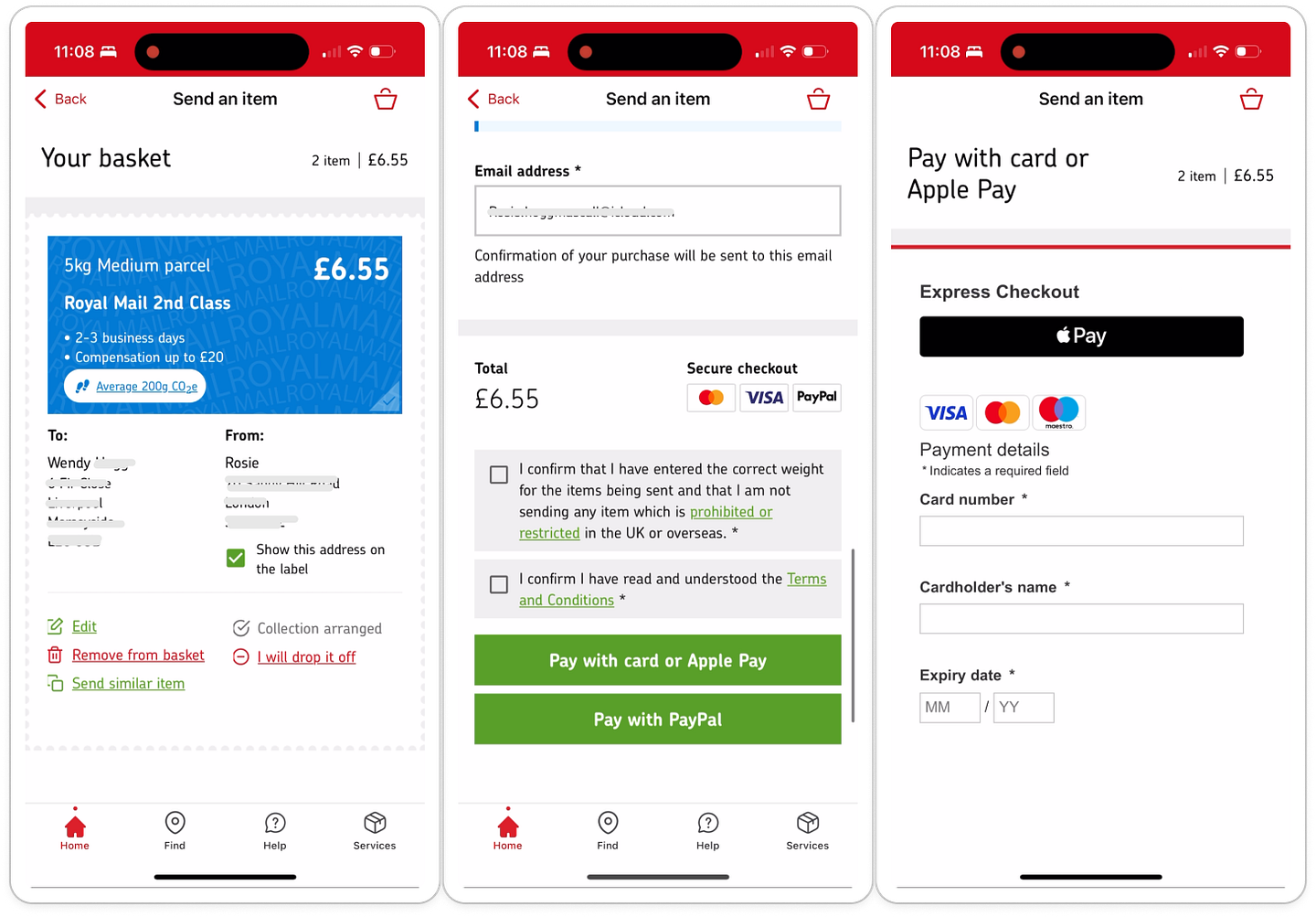
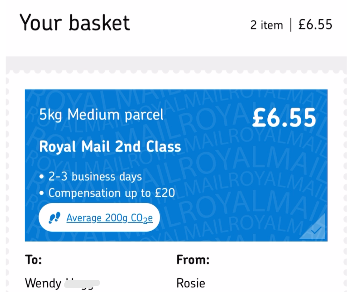
It’s thoughtful, empathetic copy. There’s even a partnership with a pet charity offering free webinars and a printable sign for your window. If that’s not cute, I don’t know what is. 5. The magic moment: sending a parcel, stress-freeI get to the homepage (after a weird log-out bug 🐞) and see three interesting details:
I get instant value from a very simple page.
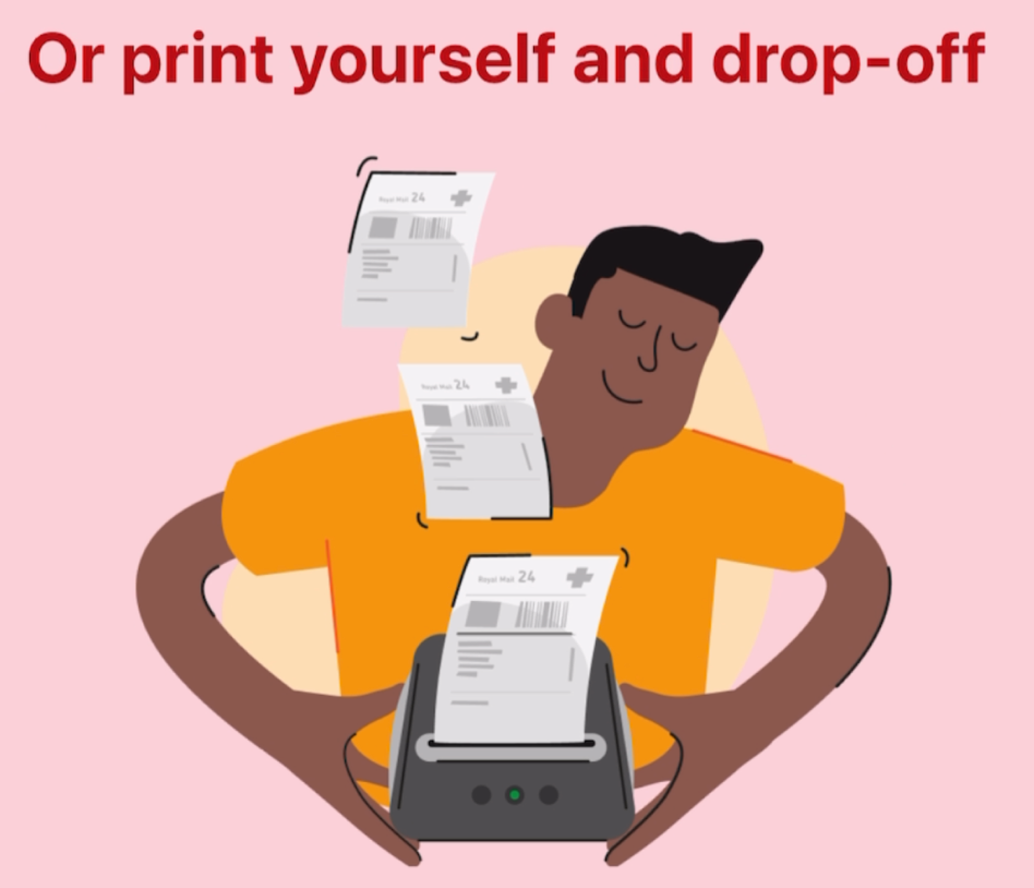
I tap ‘send’ and get yet more cute illustrations.
There’s no bigger pain than running out of printer ink while trying to print a label, hence this is my personal favourite.
Note the smiles, red brand highlights, green light on the printer, careful hands — evoking contentment, ease and care. The parcel sending flow is long, however there are a few parts we’ll zoom in on.
The illustrations carry through, making the process feel human — and helping me scan faster.
The buttons are big, bold and confidence-inducing.
Options are personalised too, like showing my nearest parcel locker. Last but not least, the language is what gets me. It feels so empathetic and relaxed. Phrases like:
It feels like I’m at the counter being asked by a real person. The UI is busy, that’s no lie. But the copy, illustrations and cosiness of the language make up for it. Then we arrive at the final hurdle: the checkout. 6. Final stop: checkout.In checkout, the summary page with a scalloped edge makes it look like a postage stamp.
Cute 🥹
I’m also told the CO2 amount I’m using up, the time it’ll take and the compensation I get on this sending tier. I buy seamlessly with Apple Pay, then get to the confirmation which is quite possibly the most compact, information-dense page I’ve seen. Almost Asian in it's app design.
I don’t hate it. It’s busy, but something about it is quaint. It’s in the small details:
From 11.01 am, when I downloaded, to 11.09 am, when I saw the confirmation, it took me 8 minutes to reach the magic moment. With the high-friction action (including payment), that’s not bad. I finish my card and present for Gran, and get it all packed up for the collection tomorrow.
Happy Rosie. The journey in a nutshell:Final thoughts: quirky, imperfect — and somehow still delightfulBugs? Yes. Quirks? Definitely. Funky spacing? Plenty.
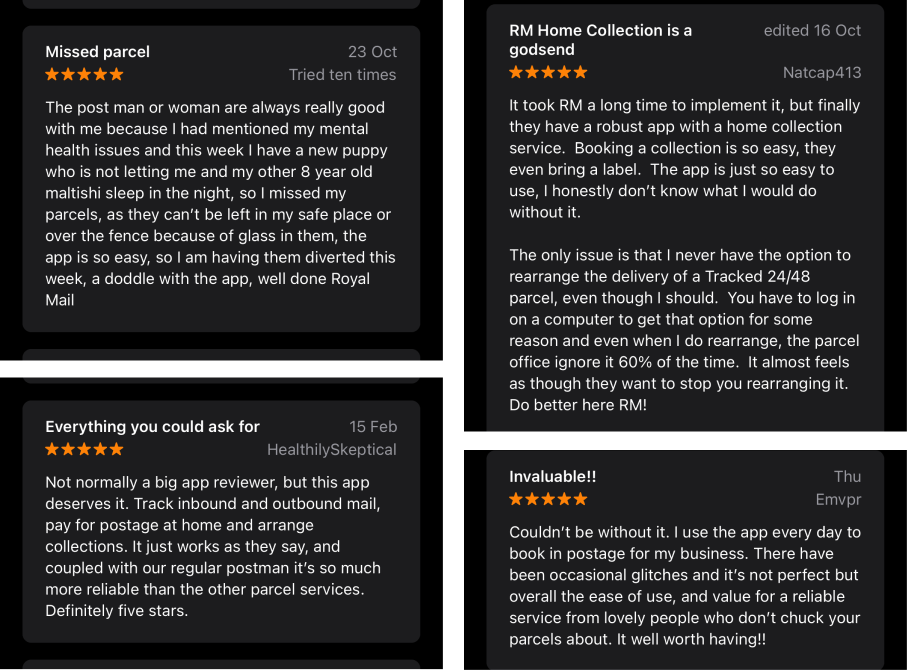
But do I feel annoyed? Not at all. Because it feels like it cares. And it’s not just me. Reading the 5-star reviews, I see that they’re largely glowing but with feedback nestled inside.
Royal Mail doesn’t try to be flashy. It’s not frictionless. But it’s full of soft signals of care — the kind that build trust, warmth and goodwill over time. It’s the small details:
Even when the app fumbles, it still feels like someone’s thought about you. And when that happens, users tolerate the quirks. Designing for delight is one thing. I feel like Royal Mail has designed for forgiveness. Orrrr…. maybe we just expect too little from these services. What’s it to be? Reply and let me know what you think. FIN This one has been a long time in the making, I thought of this topic a long time ago and never got around to actually trying out the app. Safe to say, this was a fun ride! Will let you know if Wendy likes her gift x See you next week 🕺 Rosie |


Growth Dives
Each week I reverse engineer the products of leading tech companies. Get one annotated teardown every Friday.