Each week I reverse engineer the products of leading tech companies. Get one annotated teardown every Friday.
Growth Dives: What Slack's invite flow teaches us about virality
What Slack's invite flow teaches us about viralityA closer look at the mechanics behind Slack's PLG growth loop Read online here
Slack was the fastest startup to hit a $1 billion valuation after launching in 2013. Today, it has over 42 million daily active users — including 77% of Fortune 100 companies — with paid users spending about 90 minutes actively working in Slack. Huge volumes. High engagement. And a product that’s expanded well beyond self-serve PLG into enterprise B2B (i.e. big boi companies). The dream. Slack isn’t just one of the earliest PLG stories - it’s one of the most iconic. And there's still loads to learn from it. Especially when it comes to spinning referral loops faster and more efficiently. This week’s deep dive breaks down the small UX decisions that drive a very well-oiled growth loop. We’ll look at:
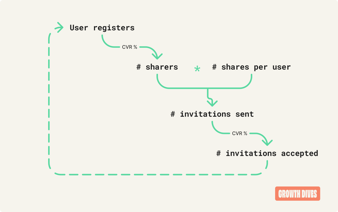
Without further ado, the formula that underpins it all. PLG basics: introducing the K-FactorPLG, sharing, referrals, virality — these concepts often overlap. Don’t get too caught up in the terminology. Focus instead on what actually drives growth. One particularly useful concept is that of the K-Factor. It measures the number of new users a single existing user brings into the product. In formula terms:
In numbers, what this means is that:
There are three core levers that influence this:
These levers all work together to drive the PLG loop of a product. The key is to track each step of the journey to spot where users drop off and focus your efforts where it matters most. We’re going to look at how Slack optimises the UX for the two stakeholders in the share loop:
Starting at the beginning, with sending an invite. Part 1 of 2: The sharer experienceI was playing around in Slack and realised I hadn’t tested the invite flow in a while. So I hit the three dots and jumped into settings.
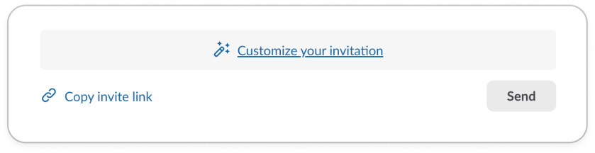
What struck me was how high up sharing sits in the settings. First option on the list. Notice how it's personalised: Invite people to [workspace name] It is also separated in its own section with two grey lines to give it more visibility and attention. I click on ‘invite’ and get a pop-up share panel in the centre of my desktop.
Again, the panel’s title is personalised with the workspace name (useful for me, given I’m in eight workspaces). Notice how little copy there is overall. Instead of a lengthly box title, the default copy helps me understand what I should do: name@gmail.com There’s also some helpful copy telling me what certain options are, like the ‘Member.’ The bit I like most is the ✨ customisation ✨
If I tap the blue hyperlink next to the magic wand, it expands to an extra two modules: channels and custom message.
In the custom message section, I see another example of great UX writing: Add a personal note to your invitation I type something in this section as a test to see where it shows up in the invite. Looking forward to having you in the group! Once I hit send, I get an excellent confirmation page that covers:
I love this because it covers off any fears or anxieties I have in this step, like:
As the person sending the invite, I’m feeling calm, content and chill. Part 2 of 2: The sharee experienceThe first time I tested the flow, I went ahead with a non-customised share invite via SMS.
With links, what’s key is that the metadata is filled in. Metadata for share links is behind-the-scenes info (like title, image, and description) that platforms like Slack use to generate link previews. Why this matters:
Notice how Slack’s metadata is:
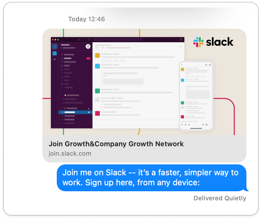
The email invite is also incredibly well-executed.
Notice:
And, this time, I filled in the message, which adds a personal touch.
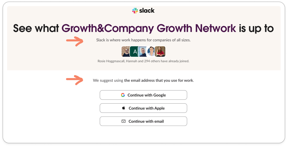
So compelling, but also so compact. The design here is really impressive. It’s all in the top of the fold, and without my customised message the CTA ‘join Slack’ would be visible without a scroll too. I click on the CTA and get to a webpage which has the same building blocks of the share invite:
Another detail that’s important is the two small bits of copy: Slack is where work happens for companies of all sizes And: We suggest using the email address that you use for work The first is useful for product marketing, answering the question: What does this product do?
The second is useful for gathering email addresses that the data team at Slack can use to work out which companies are on Slack, and whether they’re worth upselling to. This is called: Product-Led Sales. I.e. the product is sending the sales team leads, who then go on to close bigger enterprise clients. Why can’t those people convert themselves? Well, in an interview on Lenny’s Podcast, Elena Verna shared: Self-serve monetisation has a cap of about $10,000. That’s just how much we’re able to process on our credit cards before they start getting flagged and declined. She goes onto explain that after that, the sales team needs to come in to upsell above that amount and communicate enterprise value. To do this effectively, data about product usage is used to direct the sales teams to the right users and accounts who are likely to upgrade. BUT, without work email addresses, this is so much harder. Hence, Slack is making sure that people put in their work emails ahead of time in order to upsell to them later (if relevant). And this is why 77 out of 100 of the Fortune 100 companies now use Slack. (I’d highly recommend Elena’s substack on B2B growth, my current go-to resource.) Back onto the flow, and last but not least, we have the launch screen, which again is simple, personalised and has some excellent UX writing on it.
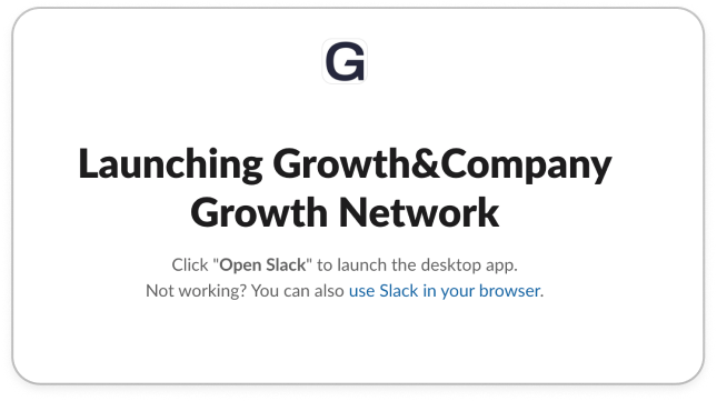
I get a pop-up from my browser asking if I’d like to open Slack, which I click. Whilst I’m waiting, I can see some simple instructions and troubleshooting, with the option to use Slack in my browser.
What’s important in this invitee experience is how the UX flows between touch points: the branding, the messaging, the personalisation and more. There’s no jarring transitions, no different fonts, instead it all feels like part of the same journey. This is super hard when you’re moving between platforms yet Slack seems to effortlessly move from email to web page to desktop. It felt easy, but execution-wise, that’s really difficult. What does this teach us about PLG loops?First, it’s worth noting that sharing is core to Slack’s business. You have to work with others. And each extra teammate on the platform improves the experience for every other teammate. This means Slack has a natural advantage when it comes to virality and referral loops — it’s structurally easier for them to achieve a K-Factor above 1. Even if your product isn’t inherently social, there are still powerful lessons here for how to design better share flows:
In short, virality isn’t magic. It’s a matter of structure, UX and psychology working together. Slack’s share loop is a lesson in how micro details — placement, copy, personalisation — combine to keep the loop spinning. Next time you’re designing a share flow, ask yourself: would this make me feel confident to invite my team, friends or family? Wooho! This was a fun one to write - funnily enough I meant to do a 60-second read this week (as it's a short week with the Easter bank holiday here in the UK), however I ended up writing 1,800 words. Oh well. If you enjoyed this - share with someone you know so we can get the Growth Dives referral loops goin' ⚙️ See you next week (where I might actually succeed in writing a quick dive for once), Rosie 🕺 |


Growth Dives
Each week I reverse engineer the products of leading tech companies. Get one annotated teardown every Friday.