Each week I reverse engineer the products of leading tech companies. Get one annotated teardown every Friday.
What's happened to Spotify?
What's happened to Spotify?Echo chambers, profit & the decline of artist discovery since 2017 Estimated read time: 8 minutes. Did someone forward this to you? Subscribe here. Every now and then, I tune into the music that’s playing in the background as I work. And I get annoyed. I’ve heard this hundreds of times. I go into the app, I hit pause and try find something else. But it’s hard to find things I want to listen to. So I lazily go for the same deep work playlist over and over, hoping that it will refresh every now and then. This under-the-surface frustration has been boiling away for a few months. And it took me a while to notice it. That was until I read, Why I Finally Quit Spotify by Kyle Chayka in the New Yorker last week, shared by my friend Ben. And then it clicked. I realised that:
But why? Surely listening to great music easily is the core value proposition of Spotify? Surely they’re driving towards that? … To try and untangle my echo chamber and lack of fresh tunes, I went waaaay back to 2017 and looked at how the homepage is structured to help us find music, and how this has changed over time. We’ll interrogate the UI, UX and overall business strategy of Spotify to find out why they seem to be optimising for something fishy. First, some commercial context that helps show us why Spotify might be pushing certain parts (** cough *** podcasts ** cough cough) more prominently in the UI. Spotify’s bumpy journey to profitability 🥴I wrote about Spotify’s return to profitability last November (2023). It was the first time since 2021 that the music streaming service had reported a profit. Throughout last year it cut 17% of its workforce and a huge proportion of its marketing spend. It also increased price. For years, Spotify’s monthly subscription sat at $9.99, That was until July 2023 when prices went up $1 in major markets. In 2024, they raised prices again by another $1.
The cost-cutting and price rises have made an impact, with Spotify’s Q2 results stating: Led by healthy subscriber gains, improved monetization, and record profitability, Spotify reported…
• Monthly Active Users grew 14% Y/Y to 626 million.
• Subscribers increased 12% Y/Y to 246 million.
• Total Revenue was up 20% Y/Y to €3.8 billion.
• Gross Margin reached 29.2%.
For the non-commercial folks out there, what’s veeeery interesting here is that 👀:
These numbers are showing better business results, but not necessarily any clear product improvements. It’s showing efficiency in the business, cost cutting and price rises.
Overall, the Q2 results that Spotify is a better business not necessarily a better product.
As a result of the general optimism in the numbers, they’re starting to splash out a bit more. The CEO recently shared that they are “going to add back some marketing spend over the year" and they’re hiring for 67 jobs right now across Europe, Asia and North America.
Why am I telling you this?With podcasts showing to be a profit-driver for the business, cost-cutting taking stage and the subtle feeling that it’s harder to find songs, what I’m going to show you next will make a lot more sense. Now, on to the fun stuff: the user experience. Spotify’s Home experienceDoes anyone else feel like this:
Every time I open Spotify recently I’ve felt lost and confused. Simultaneously overwhelmed but also underwhelmed at the same time.
It’s a hard feeling to describe. I wonder if it’s just me, and whether I’ve not curated my music properly. But I don’t think so. When I open my Spotify desktop app each morning, what I see is:
Quickly glancing over this screen, there’s no major issues. Which is why it has taken me so long to realise what’s causing my decision paralysis and frustration. But when you look closer, you see that of the 20 cards in the main view, 13 are Spotify-generated content. There’s none of my favourite artists in sight. My favourite podcasters are down the page below the scroll. It’s not a page that feels helpful or familiar to me. It feels more alien. If you scrunch your eyes, the sheer amount of content squeezed into the screen is a lot. Within each section, I start to see what’s wrong:
When I asked around friends and family, it was the same. As Billy said: How do I find any new album recently? If I search new music I get playlists.
My homepage is just playlist playlist mixes playlist playlist.
And that’s how it feels. Playlists galore. Recent homepage updates 👀As I was writing this article, I saw a pop up on Spotify desktop: Home takes centre stage!
You’ll now find Home at the top, along with Search, for a smoother navigation experience.
Exciting! I thought. Some changes. Luckily I’d screenshotted the day before, so was able to see what the update changed. Which was…drum roll 🥁🥁🥁 Not much. In fact, moving the search bar back up to the top navigation is a throwback to the navigation in 2017. I crawled the internet to find the below three images from 2017, 2021 and later, and I’m so glad I did. There’s a lot of difference now versus then, which has helped me see what I’ve been missing from my initial analysis.
In the early days, Spotify was about music.
In the 2017 UI, I could see songs, albums, playlists and artists in my left side pane, and charts, genres, new releases in my main central pane, with friends’ listens on the right. It was one-click to get to artists, and one click to albums. When I scrunch my eyes, the desktop is not overwhelming, despite being full. It feels homely, casual, cosy, recognisable, detailed & clear.
Fast-forward to 2021 and we’re looking slick. The UI has a modern vibe. More scandi in it’s feel. It’s minimal, it’s cool, it’s clean but it is still helpful. And it still includes one-click access to my artists, albums and playlists. It is stripped down, but has all the same features and entry points as before. Just with a face lift.
Fast forward to now, and it’s a visual overload. Throwing thumbnail after thumbnail of recommended content at me, with none of it really hitting the mark. It feels hard to focus on a particular part visually. When I want to get to artists or albums, it takes me multiple clicks to get there. What’s surfaced as easy-to-access content is podcasts and Spotify playlists. When I scroll down my homepage, it’s the same story. Recommendations, recommendations, and more recommendationsIn terms of what’s below the scroll, the answer is some useful stuff and more of the same:
Of the 60 thumbnails:
Wow.
52% of my homepage is podcasts, and 48% is Spotify generated content. Not a single album. Not a single artist.
These blocks change each day, but this split stays relatively similar. Podcasts are around 5% of my listening per week: I listen to 1–2 hours per week of podcasts, and around 4 hours a day of music (so 20 hours a week). Thats 20:1 ratio of music to podcasts, compare that to the 1:1 of Spotify’s homepage. It’s clear that podcasts are being pushed hard. If podcasts are being pushed in a way that’s so far removed from user listening behaviour, there must be another motive. Profit. Given the Q2 results and how podcasts are “profit centre for” Spotify, revenue has to be a guiding metric at Spotify right now. Hence why I’m being pushed so hard to podcasts. More podcast listens, encourages more shows and more podcast ads, meaning more podcast ad revenue for Spotify. With this, I’m led to wonder whether Spotify-generated content in the form of playlists is more cost effective for them than pushing albums. I wonder… What if the split of songs in the Spotify-generated playlists saves Spotify money? What if focusing on revenue and efficiency as a metric has led Spotify to over-index on the business value, and under-index on the user-value? In the New Yorker article, Kyle Chayka quotes Jarrett Fuller, a designer and professor at North Carolina State University, saying: “In the past decade.. a “user-centered” approach to design has been replaced by a “corporation-centered” approach. Rather than optimizing for the user’s experience, it optimizes for the extraction of profit. If Spotify succeeds at turning us all into passive listeners, then it doesn’t really matter which content the platform licenses. From a core user perspective, the business has to ensure they’re delivering both user value and business value. The Spotify-generated playlists is what’s causing my echo chamber. I asked around, and my peers feel the same: The algorithm is definitely just regurgitating songs that I’ve already said I don’t like and have dismissed over and over. The suggested songs on the bottom will always be the same. They basically have a long list of songs ‘that we think you’ll like’ and they pretend to refresh it but really they’ve just gone down the list to the next section. So I end up with a wall of songs I don’t want. Doug Ford, Spotify’s former Director of Music Culture & Editorial at Spotify even said in an interview: Bombarded with generic suggestions and repeats of recent listening, listeners are being conditioned to rely on what Spotify feeds them rather than on what they seek out for themselves. You’re giving them everything they think they love and it’s all homogenized It’s so hard to find new music on Spotify, people are going to other products. When I asked for advice on Reddit, the suggestions were to go elsewhere:
Something like Swipeify, a Tinder-style product that learns your taste and suggests new music.
With Spotify’s recommendations, I’m becoming a stranger to my own tastes. Not knowing what I like, only what I don’t like when it plays in my ears. And then when I go to search, it isn’t easy to find what I want. Search experience: like wading through thick mudWe see the same pattern on search. When I search Britney on mobile, I get:
Gone are the days where I can search Britney and find her songs easily. Instead, I’m stuck behind friction in the user interface to get to real artists, real albums and songs. Within the search experience on both mobile and desktop, I’m:
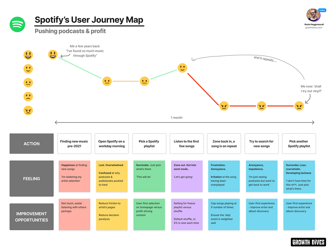
I’m not alone here. Some people are even going back to vinyl. Again, in the search experience we see Spotify pushing profit not product. Business needs over user needs. The ‘Enshittification’ of products, it’s now called. To conclude, a user journey map like downhill sledding 🛷🛷This was a hard one to write. It took me a while to notice, but when I did it was like a tidal wave. I went from enjoying the platform, to now finding it an annoyance day-to-day. What next? Perhaps vinyl. Perhaps I stick with it. I’m a lazy listener now, turned into someone in a pit of one music type without the motivation to get out. Here’s to lo-fi till the end🥂
Fin. Thank you SO much for reading (all the way to the bottom!! Look at you go). Let me know what you thought of today's newsletter. Reply and let me know (I read everything). What next? There's a few options:
See you soon!! Rosie |


Growth Dives
Each week I reverse engineer the products of leading tech companies. Get one annotated teardown every Friday.