Each week I reverse engineer the products of leading tech companies. Get one annotated teardown every Friday.
Growth Dive Mini (1-min read) 🐣 Miro’s satisfaction survey
Growth Dive Mini (1-min read) 🐣 Miro’s satisfaction surveyThanks for the feedback from my last mini dive — big success! Here’s another 60-second read: one insight, 300 words, super fast 🏎️ Read online here or download as a PDF. Last week, we covered content loops and — whilst this is mainly about Miro — this week it’s your job to spot another one 👀 So, keep your eyes peeled.
I was working on email flows with a client in Miro when I saw a banner across the bottom of my desktop screen:
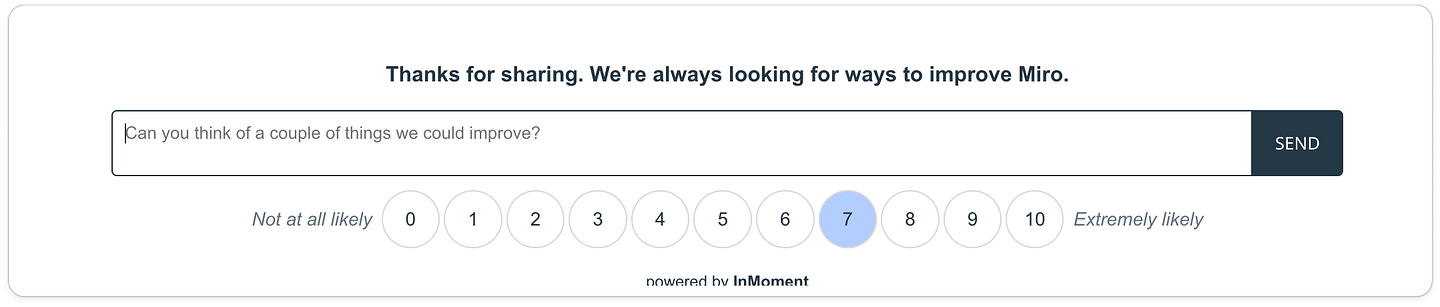
How likely are you to recommend Miro to a colleague?
What’s great about the execution of this one-question survey:
This is a classic Net Promoter Score (NPS) question, but with a twist.
The first twist is that there’s a fast-follow second question, which is an open text entry field for feedback. There's even has a nice bit of default copy: Can you think of a couple of things we could improve? To help stave off writer’s block for our customers. This is a nice value-add for the research team, offering some extra juicy bits of context behind the 0–10 scores (as well as a fair few blank or dud entries, I’m sure). But this last bit is the most interesting: the review.
I gave a score of seven, and therefore, I’m asked to leave a review on G2. This one-question survey therefore doubles as a review campaign, smart. What’s great in this example:✅ It’s a low lift for the user: just a few clicks, quite fun ✅ It’s not in the way: having the survey static means it doesn’t float in front of the navigation (a bugbear of mine) or overlap on someone’s post-it notes they’re trying to read ✅ The team juices as much as they can: they don’t just get a score, they get more context and a review. The user feels rewarded (with money), the team gets street cred. Win-win! ✅ Uses 'temptation bundling': Pairing a high-friction task (like a reivew) with something more appealing makes it easier for users to take action. We’re more likely to do the hard thing when it’s bundled with a reward or low-effort win. Potential changes to test:❓ Timing and trigger variants: Test different moments for when the survey appears (e.g., after a key action like saving a board vs a period of passive time). What drives more positive or useful responses? ❓ Survey format: The current design is clean and functional. But what about something playful, like an emoji sentiment scale? Could feel friendlier or more engaging. ❓ A subtle feedback loop: after someone submits feedback, could Miro close the loop by linking to a relevant blog post or changelog? A subtle nod that says “we’re listening” might build more trust over time.
TL;DR One Growth Insight 🚀Smart survey design doesn't just collect feedback, it creates opportunities for deeper insight and reputation building 🛡️ And finally…Did you spot the content loop? I’ll give you a clue:
InMoment has a lil’ watermark at the bottom of the module — helping get their brand out there. Nice touch. I’m curious: are you a Miro user for your whiteboarding, or do you use another tool? (Canva, Figjam, Slack..?) Thanks for reading! Short one this we as we had Monday off for a bank holiday here in the UK. So, I took myself and the dog to the seaside where he was strutting his stuff on the sidewalk. Safe to say, he was a happy boy. I'm so torn about what to cover next week, I have:
What do ya think? In any case, excited to write the next one! See you next week, Rosie 🕺 |


Growth Dives
Each week I reverse engineer the products of leading tech companies. Get one annotated teardown every Friday.